Why Should I Include a CTA on Every Website Page?
Katelyn Ahern Digital Project Manager#Digital Marketing, #Inbound Marketing

Learn why it's important to include a call to action on every page of your site.
When someone suggests placing a Call To Action (CTA) on every page of your website, you may think “that sounds like overkill, why every page?” I was one of those people when I first heard this advice, but I have come to realize why this is such a powerful strategy for helping your visitors. Here are some of the many reasons I now agree with this strategy:
Meeting Them Where They Are
It’s important to consider the problems your visitors are trying to solve and where they are in the process of solving them when they come looking for your content. You’ll want to create content for the different stages of the buyer’s cycle, and providing CTAs to match a visitor’s stage in their buyer’s journey is just as important. This means basing your CTA on the content that is on each page. Also, when deciding which content you want to lead them to, you should take into consideration their journey in order to continue to deliver the information they are searching for.
When you are planning this path for your visitors, remember that you know your website content through and through, but your visitors are new to the website. Without the CTA, they may not know that you have more content on that particular subject. Without this indication of where to go next, they might leave your website and go back to Google to search for further resources.
How many times have you gotten frustrated trying to find particular information on a website and decided it would be easier to refine your search in Google instead of continuing to blindly look around in this unfamiliar environment? I know that I do this all the time. The CTA that you create could ease that frustration for visitors. The idea is to create the CTA that helps them find exactly what they are looking for. In order to do this, you must think of your plan from their point of view. Throw out the path that you want them to follow and instead create the path to what they are searching for based on the content they have already found.
What A CTA Doesn’t Need To Be
When creating a CTA for every page of your website, you must use discretion in determining what content to provide and how to deliver it to your visitors. Here are a few aspects of your CTA’s that must be considered:
- Putting content behind a form
You must tread lightly when considering whether content should be behind a form or not. My best advice when making these decisions is to put yourself in your visitors’ shoes. Yes, each visitor is going to be different, but do your best to decide whether or not you need to capture their lead information and how much to ask for based on their journey. Also, when you do create forms, don’t stop your leads in their tracks by scaring them off with long forms - Making CTAs boring and uniform
When you are creating each CTA, get creative. They do not all have to be traditional and formulaic. They should follow CTA guidelines and the design elements of your website, but the way they look and what they say can change depending on where you place them on your website. Don’t constrict yourself without testing new ideas first. Keep track of the metrics of all your CTAs and adjust based on performance.
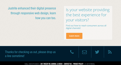
Here are some examples of different CTA formats:


These are some of the many aspects I keep in mind when creating new CTAs and planning a strategy for what to place where. Are you still not sure on where to place CTAs on your website? Let us know in the comments or reach out, and a marketing specialist can help you decide.
Related Posts

3 Pro Tips to Make Your HubSpot Workflows Successful
HubSpot's workflows are a powerful tool for connecting with your customers. We share 3 pro tips for getting the most out of your workflows.

4 Ways to Avoid Disaster When Migrating CMS Platforms
If you have ever migrated from one content management system (CMS) or eCommerce platform to another, you know how many unexpected issues can occur during the migration process.
Results Matter.
We design creative digital solutions that grow your business, strengthen your brand and engage your audience. Our team blends creativity with insights, analytics and technology to deliver beauty, function, accessibility and most of all, ROI. Do you have a project you want to discuss?
Like what you read?
Subscribe to our blog "Diagram Views" for the latest trends in web design, inbound marketing and mobile strategy.
