What’s the Best Way to Use Carousels and Sliders?
Dan Rose#Design, #Responsive Design, #Design Advice

Rotating homepage banners (a.k.a. sliders or carousels) are common on websites, but how useful are they, and what is the best way to use them?
It’s common for many websites to display some sort of rotating banner at the top of the homepage, but there are a number of variations for this type of display, with different sites using different image sizes, numbers of images, rotation speeds, and types of content. We thought it would be a good idea to look at how and why these sliders and carousels are used, so Dan sat down with Matt Brady, Diagram's Content Specialist, to share some thoughts on the subject.
Thanks for letting us pick your brain about this subject, Dan. To begin, what’s the difference between a slider and a carousel? Is there a difference?
I’m not sure there’s a widely-accepted definition for each, but in my experience I’ve used the term “slider” to reference a rotating content block housing photos/text/buttons (think: “homepage banner”), whereas a “carousel” might only show photos (think: “sidebar widget”). I don’t think that’s a reliable definition, just the one I subconsciously find myself using. They’re really one and the same, if you think about it. It’s all rotating content at the end of the day. Even their placement shouldn’t be relegated to their label, I suppose.
Do different types of image rotators work better in different locations throughout a site?
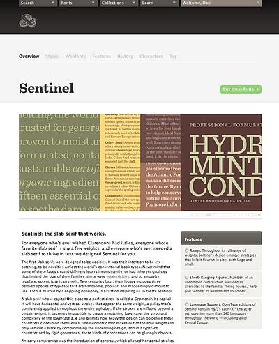
I recently stumbled on an image rotator that I think works well, and it’s the one used on individual font pages on Typography.com. It’s large, and frames the content beneath it well. While searching for a font to buy, the position of the slider, displaying the font in various applications, is incredibly helpful. Had this been smaller in the sidebar, or even underneath the body copy, I’m not so sure it’d be as effective.

So when might smaller image rotators in a sidebar make sense? Maybe as a call to action for viewing a photo gallery, I suppose. I can think of a few other ways to accomplish the same tease without running the risk of distracting someone’s focus while reading something like an article.
What is the best type of material to place in sliders? Are there any concerns about the images, such as whether titles/text should be part of the images themselves rather than as separate titles?
The scenario I see working best for rotating content is for media like photos or video. I think that was the original intent behind sliders: to emulate the experience of a slideshow. Where we often get in trouble is incorporating text, expecting someone to have enough time to read it, make a decision about it, and advance to the next slide. That said, if text is a part of your slider, having it embedded in an image is incredibly problematic if you expect the slider to be viewable across smaller screens. At small widths, embedded text scales down along with the image, and is often not legible.
What are some best practices for sliders? Is there an ideal amount of time for slides to display before switching to the next slide? What about indicators for the slide number (e.g. “slide #3 of 7”), or controls for moving forward or backward in the rotation?
It depends. Timing is tricky, even if you’re not incorporating text like I mentioned. Purely photographic rotators might be palatable with around 3 seconds per slide, but there’s no hard and fast rule. If it’s too fast, it’s frustrating if someone is trying to focus on a particular slide. If it’s too slow, you run the risk of someone not interacting with the slider or realizing there’s more slides before they leave the page. I think this supports my case of why photos might be the best kind of content. They convey flavor or spirit without the specificity that text does.
Pagination is a good practice, as long as there’s a consideration for different modes of input. For example, if you require a “click” to advance the slide, I think it’s also necessary to consider a “drag” for touch devices. The goal of pagination should be to give access to the other slides without cluttering the interface.
What consideration should be given to people viewing the website on a mobile device? How should sliders be handled as part of responsive design?
If purely photographic, I think art direction plays a role in how you format a slider on a smaller screen width. A photo that’s incredibly wide but not very tall may look great on larger screens, but when it’s scaled down to a small one, it’s easy to lose detail, focus, and other aspects. Using CSS or different images to get a more appropriate crop or aspect ratio might be a way to solve this. If the slide has overlayed (HTML) text, it’s usually good practice to drop it underneath the photo on smaller screens.
That covers the technical aspect of how sliders work. Stay tuned for part two when we will go into further detail with Dan on use-case scenarios for sliders and carousels.
Do you have any questions or ideas about sliders and carousels? Please let us know in the comments below.
Related Posts
How to Optimize Images for Better Website Performance
Learn to optimize your site with responsive images, modern formats, and lazy loading to improve performance and user experience.

User Onboarding Process: Guiding Visitors Through Your Website
We offer some tips on how to design a website in a way that helps users intuitively understand how to use it to accomplish their goals.
Results Matter.
We design creative digital solutions that grow your business, strengthen your brand and engage your audience. Our team blends creativity with insights, analytics and technology to deliver beauty, function, accessibility and most of all, ROI. Do you have a project you want to discuss?
Like what you read?
Subscribe to our blog "Diagram Views" for the latest trends in web design, inbound marketing and mobile strategy.
