What You Need to Know About Flexible Columns in HubSpot
Derrik Engel UI Designer#Tutorials, #HubSpot

Flexible columns allow for endless layout combinations. We share what you should know about flexible columns in HubSpot and how to set them up.
Flexible columns are a feature that developers can use inside of HubSpot Templates to allow content creators who are building HubSpot pages to add, remove, or re-order modules on the fly. This means when you create a page from a template that uses flexible columns, you have the ability to stack modules inside the flexible column areas while editing the page, rather than needing to modify the modules from a template level.
This gives content creators flexibility when building pages to achieve endless layout combinations while also allowing developers to create fewer templates overall. Let's take a look at how you can add these to your templates.
Creating Flexible Columns from the template-level
Creating flexible columns for templates is simple. You can create flexible columns that are empty or with "starter content" for those using them to build pages.
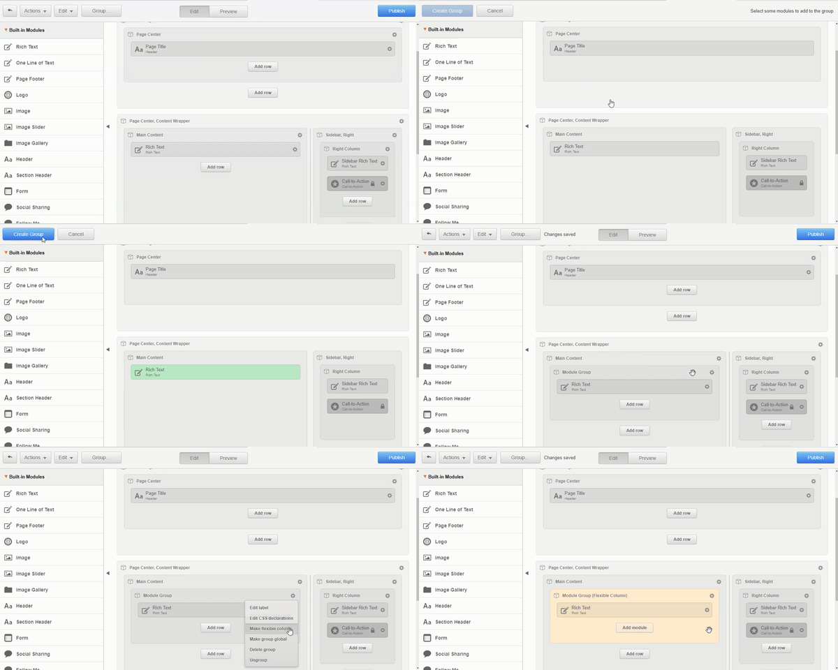
- Add a couple of modules to the template to be paired in a group and click the “Group” button.
- Select the modules that you want to appear in the flexible column by default and click “Create Group.”
- Click the gear icon in the group and select “Make Flexible Column.” Your group will turn yellow and show the "Flexible Column" text.

Now the content creator has the ability to easily add modules within the flexible column of the content editor. Let's go forward and take a look at how this is accomplished.
Using flexible columns from the page-level
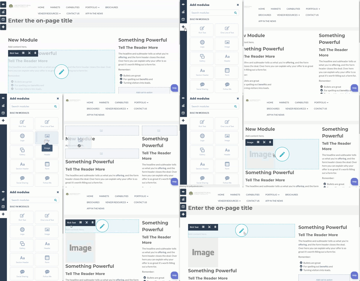
Now that we have the flexible columns in place, our content creators can make use of these in our HubSpot Pages by following these steps:
- Select a page that uses a template with flexible columns.
- Click the “Plus” icon on the left side to view a list of modules available.
- Drag the module in to a highlighted flexible column area on the page.

current Limitations of Flexible Columns
While flexible columns do make life much easier for our content creators, there are few limitations when using them:
- They cannot be used inside of Blog Templates.
- They cannot be used inside of Email Templates.
- Flexible Columns cannot be used inside of another Flexible Column.
- Items inside of a Flexible Column will be stacked. You cannot have side by side content (unless you customize using CSS).
Overall, using Flexible Columns in your template opens up a lot of possibilities for content creators while minimizing the number of templates that need to be created. Try adding flexible columns to your next template to see the endless combinations that can be created with modules page-by-page. Have you used Flexible Columns? Let us know below!
Related Posts

Transforming Content Management for Marketers with Optimizely SaaS CMS
Transform your digital strategy with Optimizely SaaS CMS. Discover unmatched flexibility, efficiency, and innovation for superior content management.

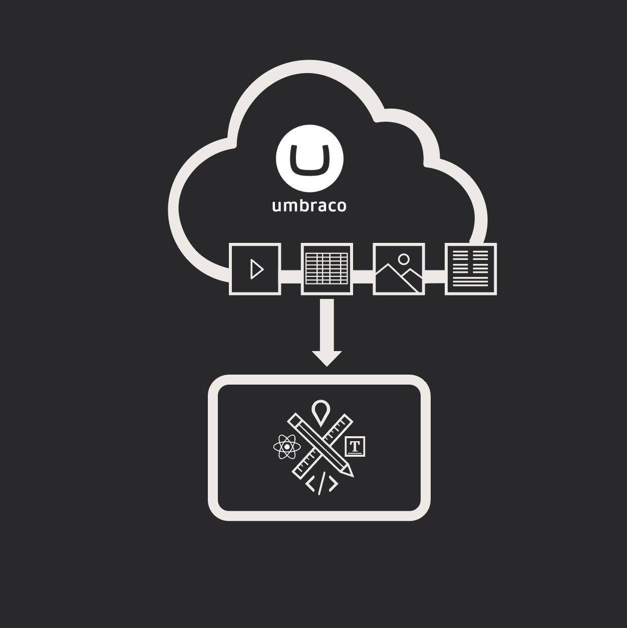
Let's Get Heartcore: Umbraco’s Headless CMS Might Be Just What You Need
Umbraco Heartcore is a headless CMS that delivers flexibility, seamless integrations, and cost savings. See why it’s the right choice for your digital future.
Results Matter.
We design creative digital solutions that grow your business, strengthen your brand and engage your audience. Our team blends creativity with insights, analytics and technology to deliver beauty, function, accessibility and most of all, ROI. Do you have a project you want to discuss?
Like what you read?
Subscribe to our blog "Diagram Views" for the latest trends in web design, inbound marketing and mobile strategy.
