Using Element Collages to Improve the Design Process
Dan Rose#Design, #Responsive Design, #Design Advice

Diagram's Design Team is continually refining our design process. Learn how Element Collages help us explore options to find the best design approach.
We've written quite a bit about how our design process has been changing the past few years. A considerable part of that change has to do with abandoning full-page, static Photoshop comps in favor of more flexible exercises that help us get our work into the browser more quickly. It's an exciting transition, but certainly one that produces a lot of questions from our clients (and sometimes ourselves).
Static comps, while not always the worst approach, created a significant stumbling block in our Responsive Design workflow. On the one hand, we could show clients a near pixel-perfect facsimile of what the developed site would look like. On the other hand, that facsimile didn't account for multiple screen widths, interactivity, diversity in how browsers render type, and most importantly, it couldn't be tested.
As we moved away from showing static comps, the need for establishing a direction in style was consequently void. While we acknowledged that we wouldn't be answering the typical question posed by our clients, "What is the site going to look like?", we didn't know how it might look for ourselves, and *that* was problematic. As great as continually iterating on style through CSS is, the absence of a baseline design sometimes results in tons of hours of experimentation.
The solution to our problem came via Dan Mall, who seems to be answering a ton of our workflow questions lately.
Element Collages Defined
Even when we were making full-page mockups, the hardest thing to fight was having to design the minutiae of each page amid the stuff we were actually excited to design. I'm not sure about you, but I'd much rather design how the hero messaging on the homepage looks than the link-filled footer.
Dan Mall's Element Collage idea takes that concept and makes it a part of an effective discussion.
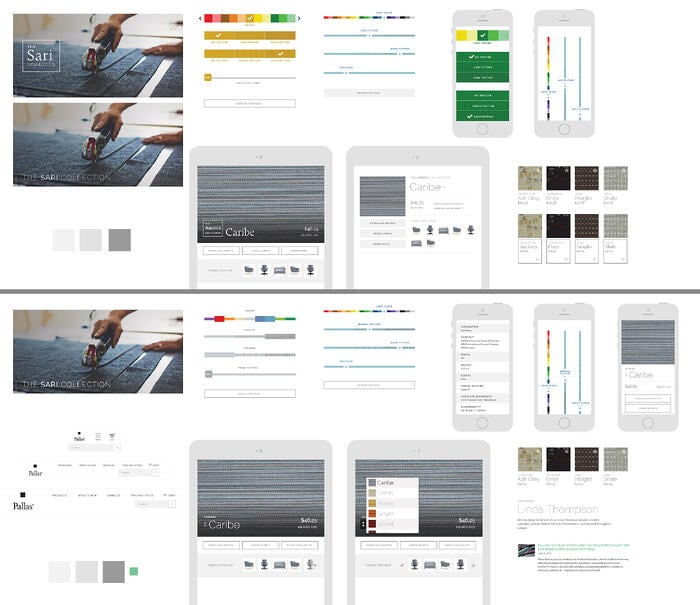
Essentially, it's a static Photoshop document that showcases the components we're itching to start imagining in high fidelity. Often, we'll put together a few different approaches for each element, which helps us weigh the value of any given approach. We're not designing complete pages, nor are we designing for just one screen width. Instead, we're designing a few pieces and considering a wide range of viewports, but not limiting ourselves to one specific approach.
Shifting from "Approval" to "Keep Going"
The best part of using Element Collages in our design process is the radical shift in their objective versus full-page comps. We're not looking to get sign-off or approval so much as we're trying to have a thoughtful critique with our clients to determine what's of value and what's not, and to gain consensus on a direction to continue exploring. Because Element Collages aren't meant to be the end-all document that traditional mockups were, we have no need to say "this is what it will look like to the pixel; please approve." Instead, we establish what styles are a good baseline to move forward with, save that implementation, and move forward with continued refinement for high fidelity prototyping in the browser.

Since our development and prototyping is component-driven, as opposed to page-driven, it only makes sense to have a style document that aligns with this notion.
Now, there are a bunch of exercises and deliverables we could use (like Style Tiles or Style Prototypes) that might make more sense on a particular project. More often than not, my personal favorite is to put together an Element Collage, because I prefer the balance they provide between specificity and abstraction.
I'm proud that we're using such forward-thinking methods in our design process. By no means will we always use Element Collages (or maybe we will; I don't know), but they currently help us get our ideas onto the screen and allow us move on to the browser more quickly. I do not miss the weeks and months of editing full-page comps to be pixel-perfect representations of single-width instances of a website, lacking interactivity and function. We're hoping our clients don't either. Not one bit.
Related Posts

User Onboarding Process: Guiding Visitors Through Your Website
We offer some tips on how to design a website in a way that helps users intuitively understand how to use it to accomplish their goals.

Accessibility Playbook Resources
Useful accessibility resources that are free for web designers, web developers, and content creators to help them build more inclusive websites.
Results Matter.
We design creative digital solutions that grow your business, strengthen your brand and engage your audience. Our team blends creativity with insights, analytics and technology to deliver beauty, function, accessibility and most of all, ROI. Do you have a project you want to discuss?
Like what you read?
Subscribe to our blog "Diagram Views" for the latest trends in web design, inbound marketing and mobile strategy.
