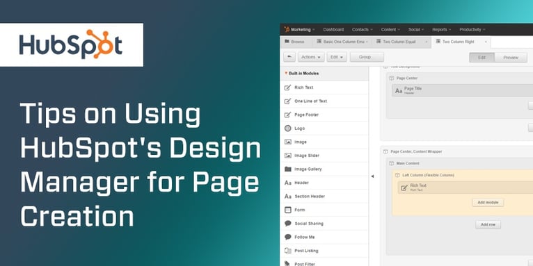
Tips on Using HubSpot's Design Manager for Page Creation
Britney Na Interaction Designer#Design Advice, #HubSpot

We share several tips for page creation using HubSpot's Design Manager.

When creating content in HubSpot, one of the tools that you will become familiar with pretty quickly is “Design Manager.” Design Manager is basically the one-stop place where you build and store all page templates, CSS files, and custom modules. All the specifics you need to learn about this tool can be found in HubSpot’s User Guide. For this blog, I will cover some of the helpful tips I’ve learned from my experience with using HubSpot’s Design Manager.
1. Be strategic about naming page templates.
This is the most important piece of advice I can offer to you. Establish how to name page templates and stick to it. If you’re working as a team, have a team discussion about the naming convention that everyone agrees with.
Make sure the naming convention is easy to understand so that it will be relevant long term. Page templates are not normally something you edit often once it’s built. If template names are complex to decipher, you may be tempted to create a new template instead of taking time to figure out what’s what.
2. Customize the placeholder content.
When you drag and drop content blocks to the template builder, some content blocks may display generic placeholder content. Instead of leaving the placeholder content as is, take a few minutes to customize it to provide instructions on how to use this content area or anything that editors should be aware of. This small change may seem trivial while you know everything about the project, but in the long run, the extra effort may help you and your team tremendously when you have to revisit the page template later.
3. Flexible Columns are your best friend.
If you are not familiar with flexible columns, you can read this post to learn about this awesome feature. If you have any experience of building a HubSpot page, you will understand the power this feature allows you to manage content modules from a page level.
When I build a page template, my rule of thumb is that anything that I know for sure what is required on every page, I use specific content modules, e.g. headings or CTAs. Any other content, I use flexible columns. This helps me avoid creating many page templates for one or two pages.
4. Switching page templates is not easy in some cases. Plan carefully which template to use for page creation.
One of my mistakes in my early HubSpot years was expecting that swapping page templates after page creation would be as easy and smooth as building page templates. Alas, I learned it a hard way that it may not be in some cases. Originally, I had some pages that needed the three-column layout in one area. Later, I had to switch the page template to use two columns instead and expected that the content in the last column would remain on the page once the template is changed. To my surprise, the content was gone. I had to reenter the content again in the new template.
The Design Manager is a powerful tool that allows anyone, designers, and non-designers, to plan and design page templates flexibly without editing the back-end code. Don’t be afraid to experiment new features in Design Manager as HubSpot continually make improvements. Do you have your own tips on things that you've learned using Design Manager? Share them in the comments below.
Related Posts

3 Pro Tips to Make Your HubSpot Workflows Successful
HubSpot's workflows are a powerful tool for connecting with your customers. We share 3 pro tips for getting the most out of your workflows.

User Onboarding Process: Guiding Visitors Through Your Website
We offer some tips on how to design a website in a way that helps users intuitively understand how to use it to accomplish their goals.
Results Matter.
We design creative digital solutions that grow your business, strengthen your brand and engage your audience. Our team blends creativity with insights, analytics and technology to deliver beauty, function, accessibility and most of all, ROI. Do you have a project you want to discuss?
Like what you read?
Subscribe to our blog "Diagram Views" for the latest trends in web design, inbound marketing and mobile strategy.
