
Learn why you should fight the urge to cram as much information as possible on your page, and use whitespace to let it breathe instead.
“Whitespace” is a term that gets thrown around quite often in design critiques. It’s discussed not just in web contexts, but also in print, painting, and just about any environment where layout and composition play a factor. Your dinner plate has it. The walls of your home have it. A subdivision of houses has it when viewed from above.
Contrary to popular belief, whitespace is not defined as space that’s literally white in color. Many people tend to think of Apple as the champions of whitespace (deservedly so) but there are plenty of others instituting the principle through different colors, patterns, textures, etc.
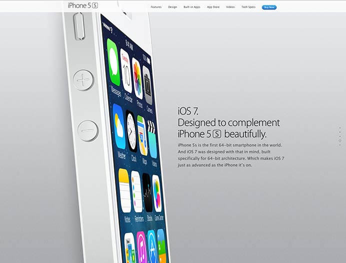
Apple has long leveraged scale and whitespace to highlight the beauty of their products, the heroes of their brand.
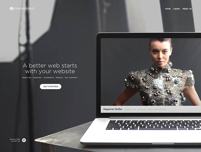
An example of using a photograph as whitespace to frame content.
I’ve worked with many people who initially laud the concept of whitespace as a good thing, but it inevitably turns in to something they want to eliminate. It’s this paradox that inspired me to touch on a few reasons why whitespace has increased in importance in contemporary web design and shouldn’t be discarded so hastily.
Let the Content Shine
I contend that the goal of whitespace isn’t to put focus on what’s not there, but rather on what is there. Hold your content in high regard: it’s the reason someone visits your website. You can make the type as large as you want, give it an obnoxious color, or put it in a marquee (please, please don’t put your type in a marquee). No matter how you try to emphasize a piece of content, it needs room to breathe. It demands room to breathe. Otherwise, it’s lost in a sea of text and photos that are crammed together and difficult for people to digest (I’ll get to this in a moment).

Marvel’s homepage uses plenty of whitespace to frame each section’s content.
Of course, I’m guessing you have many messages, and if we gave each of them equal whitespace, we’d have a hard time knowing what’s the most important. In an effort to establish hierarchy, a scale of type is often used, logically. Therefore, it makes sense to apply whitespace proportional to the size of the content. For example, a 50px Heading 1 with 100px of space on each side might be followed by a 40px Heading 2 with 80px of padding, and so on. This should be done consistently throughout the site, and not on a case-by-case basis.
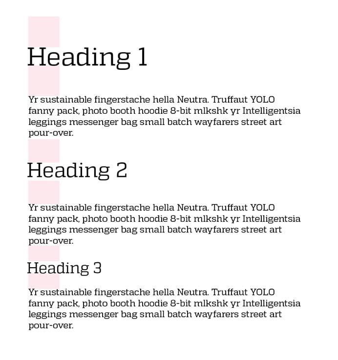
The bigger your type, the more padding it demands, scaled consistently and appropriately.
I say this to deter you from wanting to eliminate whitespace on a page-by-page basis. We often focus on the homepage, but established design principles should be evident regardless of page or template.
In any event, what’s important is that your messages, the thing you so desperately want someone to react to, aren’t a victim of inconsistency or competition.
Space to Play (Small Screens)
Even though your device is small, that doesn’t mean you’re comfortable sacrificing font size. Beyond readability benefits, when text is linked or in the case of a button, the text justifies being large enough that it can be pressed with a finger. Larger text, then, justifies larger amounts of whitespace surrounding it.
Consequently, on smaller, touch-enabled devices, whitespace allows room to drag, flick, swipe, and otherwise navigate a page that doesn’t involve directly pressing text. Ever visit a site on your phone that’s loaded with small links crammed against one another? It feels like your thumb is in a minefield. Even just giving the impression that there’s enough space around your content can help someone feel more in control of their experience.
Space to Roam (Large Screens)
It’s not your fault if you think 1024x768 is the standard size we should be designing for. That was the case for a long time, until recently. And though the proliferation of devices and screen sizes demands we don’t design for any one size over another, larger screens are commonly lost in the mix. As an Apple Thunderbolt Display user, I can assure you that there’s nothing more frustrating than seeing a webpage only take up 20% of my screen. I know… #firstworldproblems

Le sigh.
Regardless, sites with increased whitespace are befitting of larger displays as well, quite naturally. Now, I know what you’re thinking: “why cater to large screens and use 200px of padding when 40px works just fine on small ones?”, and that’s absolutely valid. A useful tactic I’ve discovered is setting section padding (top and bottom), for instance, to a percentage of the screen. Padding set at 5% might mean 40px on a small screen, 100 on a mid-size one, and 200 on a large one. Fun, right?
It’s my belief that whitespace can greatly help a user feel comfortable interacting with your site, independent of what device or size screen they’re using at the time.
Objection! Nobody Wants to Scroll!
This is probably the number one objection I encounter, not just in terms of whitespace but for web design in general. I won’t humor you with the rationale here, because you’ll see that I can talk for a while about the topic. But we can confidently say users do scroll, quite a bit, and not against their will. If there’s one takeaway from this article, it’s simply this:
Whitespace is worth keeping, no matter how much content you have.

I’d rather scroll for days than try to process all the content on this page in it’s current state.
Yet, there’s this force that sometimes compels us to say “let’s close up the whitespace to push up the content!”. I’d strongly advise against this notion. How much space do we sacrifice to get X amount of content visible? To whom? On what screen? With how many toolbars open? With how much of their screen being filled by the arbitrary size they opened up their browser that day?
See where I’m going? There’s no “most users” to cater to. We cater to all or we cater to none.
In the case of small, touch-enabled devices, the emphasis must be put on tap-ability. “Can I read and use the functions on this site?” should triumph over “do I have to scroll?”, every time. Are your hit targets easy enough for someone with large thumbs to press? Try to not worry that said thumbs will become fatigued by scrolling. Have you ever suffered physical exhaustion from using your phone? On one website, no less? While the goal isn’t to have pages longer than they need to be, the goal also shouldn’t be to put a cap on how long they want to be.
Objection! The Space Could Be Put to Better Use!
If you often find yourself thinking that “empty” space could be put to better use, chances are filling it with content isn’t the solution. It could just be that an expanse of solid color isn’t in keeping with other areas that could have patterned or textured backgrounds, making the space in question seem “visually uninteresting”. In that case, it’s important to assess these areas in the lens of consistency rather than opportunity.
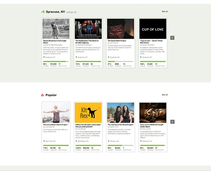
Even though there’s large expanses of solid color, it’s done consistently to establish pacing.
Fight the urge to fill in “gaps” and “holes”. They might be doing more for you empty than they would full. Just like you’d want ample space surrounding your logo, so should you treat important messages and content.
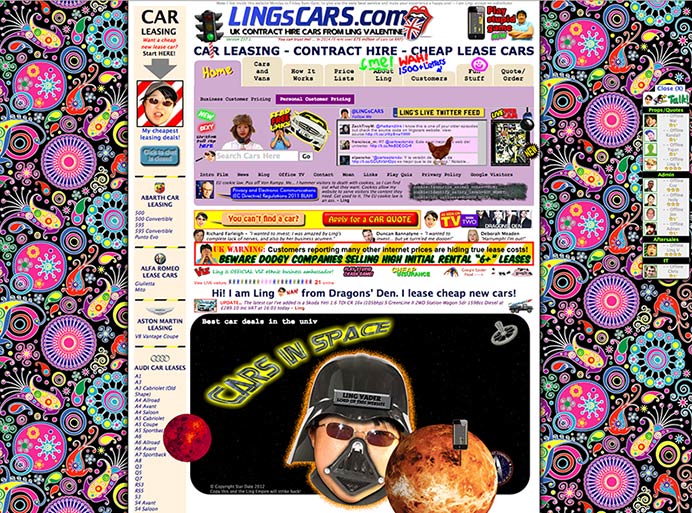
The antithesis of whitespace.
Learning to Trust
Admittedly, it’s hard to determine what’s too much whitespace and what’s not enough. A seasoned designer does this on a daily basis. Trust that the design being employed will give ample opportunity for your messages to reach the eyes of someone looking for them. Whitespace indeed helps in that regard. Discard it at your own peril.
Related Posts
How to Optimize Images for Better Website Performance
Learn to optimize your site with responsive images, modern formats, and lazy loading to improve performance and user experience.
User Onboarding Process: Guiding Visitors Through Your Website
We offer some tips on how to design a website in a way that helps users intuitively understand how to use it to accomplish their goals.
Results Matter.
We design creative digital solutions that grow your business, strengthen your brand and engage your audience. Our team blends creativity with insights, analytics and technology to deliver beauty, function, accessibility and most of all, ROI. Do you have a project you want to discuss?
Like what you read?
Subscribe to our blog "Diagram Views" for the latest trends in web design, inbound marketing and mobile strategy.