Real Life Examples of Solid CTA Buttons and Image CTAs
Sarah Corley#Inbound Marketing

We look at some great examples of Calls-to-Action that simply and effectively communicate the next steps that a site's users can take.
One of the key parts of an Inbound Marketing strategy is creating compelling Calls-to-Action (CTAs) that let your prospects know what steps they can take next. Ideally, your CTAs should provide a clear direction for your site visitors, demonstrating the value that they can get from completing the action and encouraging them to do so.
Using CTAs may seem simple, but creating CTAs that get their message across simply and effectively can take a lot of skill. We’ve put together some great examples CTAs that do this well:
CTA Buttons
Call-To-Action buttons are buttons that are used on your website and landing pages to guide your users towards your end goal. They usually include text like “Start Now” or “Download Today,” and their primary role is to encourage the user to click the button to take an action.
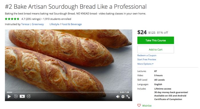
1. Udemy

With over 40,000 courses and 12 million students, Udemy offers users a chance to find non-collegiate classes in a variety of industries for less than $24 per class.
Why the CTA Works
This CTA button bucks the traditional, “Sign up” message and opts for more straightforward “Take This Course” and “Add to Cart” options. Notice how the color of the “Take This Course” button highlights that action they’d prefer you to take.
2. HubSpot

HubSpot, founded in 2006, is an inbound marketing and sales platform that helps companies attract visitors, convert leads, and close customers.
Why the CTA Works
The blue call-to-action button contrasts with the orange-brown color cast of the photo, while also tying into the blue background. “Take a Quick Tour” allows the user to decide if they have the time to get a quick and deeper understanding of how HubSpot works.
Image CTAs
In image CTAs, the text and button work in tandem with an image to lead the user to take action. A CTA button is usually embedded or designed into an image CTA, meaning that sometimes just clicking on the entire image will take you to the desired page.
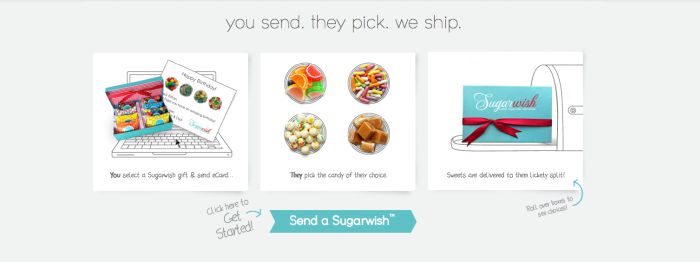
1. SugarWish

If you haven’t heard of this gem of a company, you’re in for a real treat—literally! How does it work? You choose a size of candy gram and then an eCard to send to someone. The recipient gets your eCard and logs in to choose what kind of candy they want. SugarWish then packages and sends that candy straight to their door.
Why the CTA Works
This homepage image CTA is successful because the call-to-action, “Send a Sugarwish,” is simple while standing out due to using a nonstandard CTA shape. In this example, the images do the heavy lifting and make it easy for the reader to want to click and learn more about each part of the process.
2. Loft

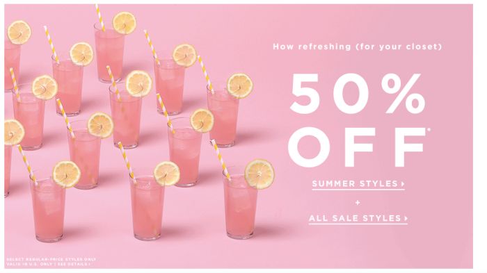
Take a look at this web banner and CTA from Loft, a store that sells women’s clothing. This web banner CTA is actually a GIF where each glass of lemonade moves towards the large “50% Off” text.
Why the CTA Works
This CTA uses motion to draw the readers eye immediately to the words, “50% Off.” The clever wording, “how refreshing (for your closet),” ties into the lemonade theme. What’s interesting is that there is no official CTA button; instead, Loft has chosen to hyperlink the “Summer Styles” and “All Sale Styles” text to the two sections of their site with sales.
3. Oreo

Oreo has branded itself as “Milk’s Favorite Cookie.” In fact, their “Dunk in the Dark” campaign during the 2013 SuperBowl still has marketers and advertisers talking to this day.
Why the CTA Works
This image CTA combines simple imagery and a classic CTA button and wording with a small amount of text. It’s effective because the text doesn’t tell you much about what you’ll be learning about, but that’s what makes it so intriguing to click! The words “Open Up to Wonder” are talking about opening the Oreo cookie, but also about the banner itself—clever!
I hope that these examples inspire you to create your own awesome CTA buttons or image CTAs. Feel free to share your favorite examples in the comments below!
Related Posts

Generative Engine Optimization (GEO): Creating Content For AI-Search
Generative Engine Optimization (GEO) boosts your content's visibility in AI search. Discover 5 key strategies for platforms like Perplexity and Gemini.

Accessibility Playbook Resources
Useful accessibility resources that are free for web designers, web developers, and content creators to help them build more inclusive websites.
Results Matter.
We design creative digital solutions that grow your business, strengthen your brand and engage your audience. Our team blends creativity with insights, analytics and technology to deliver beauty, function, accessibility and most of all, ROI. Do you have a project you want to discuss?
Like what you read?
Subscribe to our blog "Diagram Views" for the latest trends in web design, inbound marketing and mobile strategy.