How to Create Section 508 Compliant Content in Episerver
Kendall Smith QA Team Lead#Design, #Episerver

We share some valuable tips for how to make sure the content you create in Episerver meets Section 508 standards.

We’ve previously looked at how to test your site to determine if your existing content has any Section 508 issues, but it’s also important to keep these standards in mind when creating new content. Since we regularly work with the Episerver CMS, we wanted to share some tips for creating content in Episerver that meets Section 508 compliance.
Images
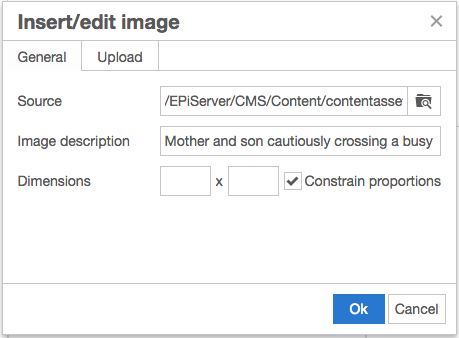
All images, excluding those that are just for decorative purposes, need to include helpful alt text to provide a description of the image for users with visual impairments. When working with a rich text field in Episerver, the alt text is set through the "Image Description" field in the "Insert/Edit Image" window.

NOTE: The newer versions of the rich text editor (TinyMCE version 4+) automatically set the image description as the image’s filename, which is often not what you want as the alt text (ex. “hero-banner.png”). Bad alt text can be worse than having no alt text at all, so it’s important to update every image manually.
Links
All links on your site should have descriptive labels and provide a clear explanation of what the user can expect to find when they click on it. Replace generic labels with helpful labels that answer questions rather than introducing new ones. Ambiguous links like “View More” or “Click Here” should be replaced with clear labels such as “View All Upcoming Summer Events” and “Subscribe to Our Weekly Newsletter.”
In Episerver, when you assign a link, you should have the ability to modify the display text. If not, reach out to your website’s developer as there may be some cases where they need to include an additional “Link Text” field.
Tables
In order to ensure your content is accessible, all tables with header rows and/or header columns will need to be set up with the appropriate HTML structure so screen readers can understand how to read the information.
To accomplish this in Episerver, you will need the Table plugin to be enabled if you’re using TinyMCE version 4 or higher. For older versions of TinyMCE, the table toolbar options just need to be assigned through the admin UI.
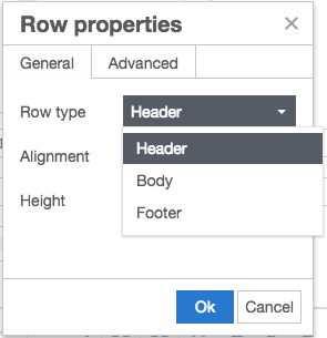
First, set the top row as the header row by following these steps:
- Click into the first cell in the top header row and then click Table > Row > Row Properties in the toolbar.
- Set the Row Type to “Header.”
- Click Ok.

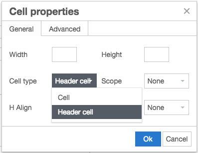
Next, you will need to assign the header cell type to each cell in the header row:
- Highlight all of the cells in the top header row and click Table > Cell Properties in the toolbar.
- Set the Cell Type to “Header Cell.”
- Click Ok.

When creating tables, avoid spanning cells across multiple rows or columns. Complex tables aren’t fully supported by all screen readers, so the information in these tables could become lost during translation.
Additional Accessibility Tips
While the tips above are specific to Episerver, the following tips apply to any website content:
Forms
When creating forms, be sure that each field includes descriptive alt text explaining what type of information should be entered or selected. Section 508 requires that alt text be assigned to every form element, including text entry fields, radio buttons, drop down fields, Submit buttons, etc.
Video and Audio Content
Any type of playable media content, such as YouTube videos, should not be set to play automatically. You should also be sure that the controls are not hidden and provide closed captions for any video content if they are not automatically generated through the external video source.
Page Headings and Styles
Each page should include an H1 heading as the page title, followed by the appropriate subheadings to break up different sections of content. These subheadings should flow naturally, using H2 headings for the first level of sections, H3 headings for subsections within those sections, and so on. Avoid skipping certain heading levels, even if they might seem more visually appealing (ex. H1 -> H3).
When styling content, only use the pre-defined CSS styles for your site. Don’t introduce any in-line styles to change the color of text or the style of your links.
Following these tips when creating content will ensure that your site is accessible by every user, whether they are using a traditional interface or need to employ an interface like a screen reader. Do you have any questions about Section 508 or anything else related to website usability or user experience? Please contact us, and we’ll help you ensure that you’re meeting the standards that will make your site compliant. If you have any tips of your own, please feel free to share them in the comments below. We’d love to hear from you!
Want to Know More About Accessibility?
Here's more detailed information about Web Accessibility and Section 508.
Related Posts

Website Content Migration and Knowing What to Keep
With website migrations not all content should be moved. Here are the first critical steps to begin analyzing your content prior to migration.

Why Choose a CMS?
We look at the advantages that a Content Management System (CMS) can bring to your digital and content marketing strategy.
Results Matter.
We design creative digital solutions that grow your business, strengthen your brand and engage your audience. Our team blends creativity with insights, analytics and technology to deliver beauty, function, accessibility and most of all, ROI. Do you have a project you want to discuss?
Like what you read?
Subscribe to our blog "Diagram Views" for the latest trends in web design, inbound marketing and mobile strategy.
