Greener Grass: Future or Current Web Design Apps?
Dan Rose#Design Advice

There's been significant buzz around a few next-gen web design apps coming out. What are they and what workflow problems do they aim to solve?
Part 1: The Design Apps of Tomorrow
I've been in this ever-changing web design industry for just about 10 years now, and one of the more common themes through the years has been "we need a better web design app". Early web designers adopted Photoshop as their tool of choice, and for better or worse, it's maintained it's status as the industry's flagship app. As we've discussed in previous articles, static comps were the deliverable of choice just a few moments ago, but they've been replaced by a great many new techniques, and so, Photoshop seemingly has gone the way of the dodo.
The question remains: if not Photoshop, what tool do we use to design for the web?
I'll preface the remainder of this article by saying that although I attribute my work on Photoshop Etiquette to be the most significant (personally) to date, I'm by no means close-minded when it comes to what app makes the most sense for web design. In fact, it's open-mindedness that's required to develop strategies when designing for the responsive web. To regard Responsive Web Design as a passing trend is an injustice to just how big a shift it is technically and conceptually, and with that should come a significant reconsideration of the tools we use.
So What's Out There?
For a recent presentation I gave at Future Insights Live 2013 in Las Vegas, NV, I did some research in regards to what design apps are currently available, or coming soon. In most instances, I tried my best to download or demo what I could, and in those instances I couldn't, I contacted the fine folks making the app (Side-note: I highly recommend doing this in whatever field you're in. Taking a step back and reassessing what tools you use against what's available is incredibly humbling and invaluable if you're open to adopting something new).
On Image Editors
I won't spend much (read: "any") time discussing the subtle differences between Photoshop, Fireworks (R.I.P. 2013), Pixelmator, Sketch, Acorn, or any others. Rather, while any image editor is helpful for asset creation, they each fall frustratingly short in the quest to become the "ultimate web design app", since you're given a static canvas to work with. It's my belief that if you're designing responsively, the canvas you work with should be fluid. In-app workarounds to draw multiple static canvases aren't ideal, and since the canvas is so crucial to designing, let's just say that image editors leave far too much to be desired. What we're looking for is an app that can handle the nuances of how a layout changes at different widths.
Color Me Intrigued
Adobe Edge Reflow
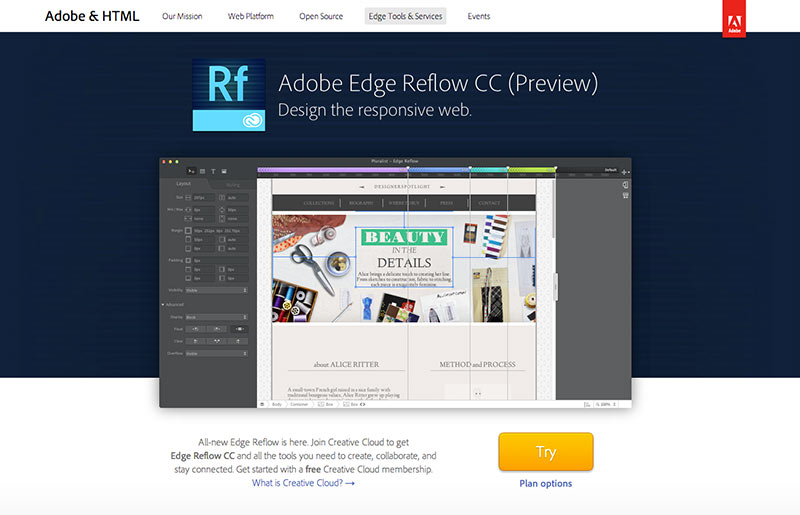
Reflow was the earliest to the party, at least in terms of exposure. Of all the apps I've seen, Reflow does the best job at visualizing breakpoints, indicated by adjustable bars above the canvas. As it's name implies, you can create elements at one width, and at another reflow their layout position. The workflow is incredibly natural, and although it's a native app, it's built on Chromium, so you're all but guaranteed accurate browser rendering. Of course, Reflow has the Adobe pedigree backing it, which isn't insignificant. I asked around on Twitter about who we felt would produce the next best thing in design apps, and because of it's trustworthiness and longstanding relationship with the design community, Adobe was the clear choice. Soon, Reflow will be able to leverage all those Typekit fonts coming to the desktop as well.
Webflow
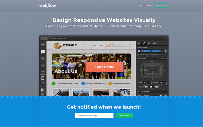
There's been a fair amount of buzz around Webflow and it's easy to see why, just playing with the demo. The interface is concise and easy to pick up. Again, being in the browser, it's easy to trust how your design choices will translate. All of your editing options have clear CSS implications, which is something missing from traditional image editors. Webflow also stores the suggested code in proximity to the elements you create, which is great for anyone looking to design in Webflow and handcraft their own code. In talking to co-founder and designer Sergie Magdalin, it's evident Webflow wants to be, and is, positioned to be the ultimate web design tool, since it strives to accommodate every step of website creation process.
Froont
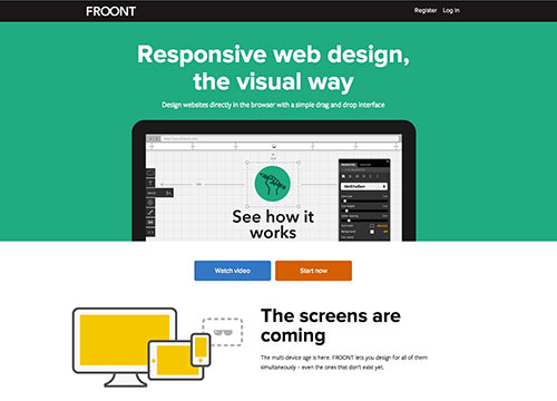
I had the pleasure of meeting co-founder Sladjis recently, and you could tell by his enthusiasm that Froont is a product set to address a lot of the challenges that come with designing responsively. The theme of Froont is unequivocally "design and present in the browser", a strong suit of the app since it runs right in your browser. You can adjust images and type similar to other apps, but what you're left with is a URL to share with clients and teammates alike. I initially passed this off as a really good prototyping tool, but it's becoming more evident that Froont has some of the tools needed to produce well-considered designs.
Macaw
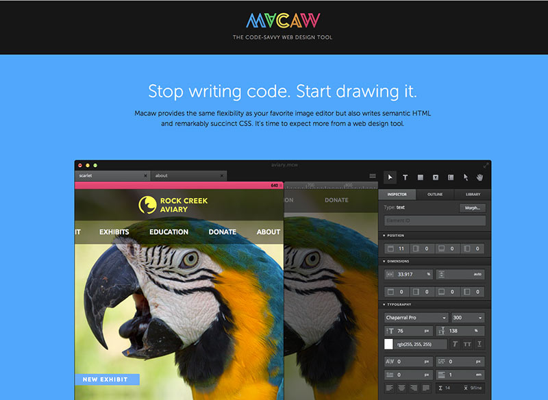
Macaw is an app that flew under my initial radar when scouting promising design apps. Creator Tom Giannattasio got in touch with me and proceeded to impress by describing some very unique aspects of his software. The most attractive feature I gleaned was its code writing capability. Now, I disclaimer this by saying that as a hand-coder, I'm incredibly reluctant to have a program write it for me. However, Macaw essentially learns how you design and adjusts the CSS it writes accordingly, in an effort to cut back on making every element you have unique. As Tom put it, "the CSS from Macaw is often more succinct than you would think to write yourself." Pair that with a reusable component library, and this app has me the most intrigued.
What Does This Mean for You?
It depends. If you're a web designer, it's an exciting time where apps are just now coming out that start to address key workflow issues we've had in the past. My advice would be to stay open-minded, ready to adopt new software but discerning enough to make sure it's worth it. If you're a web developer, these tools may be a relief or a frustration, depending how you're currently set up to receive design work or code. If you're someone looking to have a website built, there's arguably never been a more chaotic time in terms of design workflow, but the tools available to us are providing not only easier ways to produce our designs, but potentially better ways of communicating them with you.
Responsive Web Design has turned a lot of what we thought we knew about web design on its head. However, we're approaching design in better ways than before, and the aforementioned programs are accommodating the shift in thinking. I, for one, welcome the litany of new design apps with open arms.
Of course, Reflow, Webflow, Froont, and Macaw are only tools. What if they end up falling short? I'll cover that in Part 2.
Related Posts
How to Optimize Images for Better Website Performance
Learn to optimize your site with responsive images, modern formats, and lazy loading to improve performance and user experience.
Accessibility Playbook Resources
Useful accessibility resources that are free for web designers, web developers, and content creators to help them build more inclusive websites.
Results Matter.
We design creative digital solutions that grow your business, strengthen your brand and engage your audience. Our team blends creativity with insights, analytics and technology to deliver beauty, function, accessibility and most of all, ROI. Do you have a project you want to discuss?
Like what you read?
Subscribe to our blog "Diagram Views" for the latest trends in web design, inbound marketing and mobile strategy.
