Exploring Inspiration with Visual Inventories
Dan Rose#Design Advice, #Discovery

Learn how Visual Inventories can help you determine the best approach for designing your website.
My house was built last summer, and in year one, my goal was to grow an acre’s worth of grass to establish my lawn. Sporadic as it may be, I’m content enough with it this year to move on to dressing up the front of the house with some landscaping. Problem is, I truly have no idea where to even start. My gut tells me, though, that before I haul off to Home Depot, I’ll need some inspiration.
It’s funny: before this endeavor, I don’t think I even noticed what other people chose to do, and now I can’t look at a house without assessing if I like the way it’s landscaped. And so, I take pictures, toss some things together on Pinterest, and cut out pages in magazines in the hopes of finding the right combination of plans. Even still, I have a hard time imagining if a huge lilac tree is going to work the same for me as it would someone else. I know what looks good to me subjectively, but I’m right back at square one since I have no way of being certain.
The same is often true for web design. There’s no shortage of sites to draw inspiration from, and we all can craft a list of what we like and don’t fairly easily. Sometimes, we’ll even rationalize that because Apple’s site looks great, let’s make ours just like it and bask in the same success. Fool proof, right?
Inspiration vs. Execution
I hope it’s self-evident that aspiring for your site to be the next apple.com is a slippery slope. Your site and Apple's site have different goals, audiences, design principles, assets, etc. and these aspects all go in to a one-of-a-kind execution that’s not only difficult to replicate but truthfully, isn't worth trying to.
What is helpful, however, is something that drew you to their site in the first place. Maybe it’s their iconic use of whitespace. Perhaps it’s the succinct copywriting. It could even be the grayscale color scheme that allows their photography to be so heroic. These are the inspirational bits worth focusing on, and we can help you implement these techniques in a way that works for you through a Visual Inventory.
Defining the Realm of Possibility
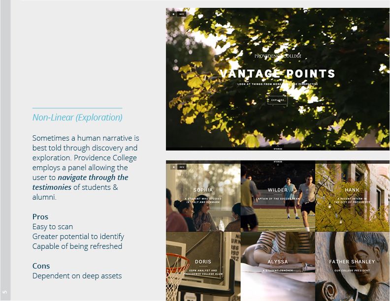
A Visual Inventory (thanks, Dan Mall) is a document showcasing elements such as concept, story, typography, color scheme, and more. Within each element, we break down a few different approaches and show a great example of it already happening on the Web. For example, there are a few different ways to approach color: a bright palette wide in range, monochromatic, or even primarily grayscale. Our goal is to have a discussion around each approach, assessing if it’s a direction worth exploring.

A screen from a recent Visual Inventory: one example of how a story can take form on the Web.
The benefits of this discussion are primarily three-fold. For the designer, it gives insight as to what is within the realm of possibility when exploring style. We focus on the most appropriate paths for the brand. In a recent discussion, it came to light that handwritten typography wouldn’t align well with a certain brand because of the more stoic, established tone they desired. When we all agreed that was the case, we could confidently refocus typographic efforts in other directions. For the client, the exercise provides the requisite guidance to organize their ideas and inspiration. For both parties, Visual Inventories are helpful in terms of establishing a shared vocabulary of what collective approaches are valuable and can hopefully impact the project.
“Just Show Me What It Will Look Like”
The above comment is one from an antiquated process, where designers first show up on the scene with a variety of Photoshop comps of a proposed homepage. There’s much more value in a collaborative discussion about ideation than presenting a smattering of uninformed “solutions” for a client to subjectively choose from. The Visual Inventory is a powerful and refreshing tool to kickstart design conversations, and for us, is quickly becoming indispensable. There’s no magic happening behind the curtain. Clients are invited to be an active participant in the design process, and this is just one of the ways we encourage collaboration.
Do you have any questions about how you can use a Visual Inventory in your site design process? Do you want to know more about our process of collaborative design? Please feel free to leave a comment below, or contact us to speak with a design expert.
Related Posts

Choosing Your Digital Future: All-in-One vs. Best-of-Breed
All-in-one vs. best-of-breed: discover how your 2026 CMS choice shapes cost, flexibility, and AI adoption.

Why Do I Need an SSL Certificate?
Without understanding what an SSL Certificate is, it may be hard to realize why this is so important for your website. In this blog Diagram will cover both of these topics.
Results Matter.
We design creative digital solutions that grow your business, strengthen your brand and engage your audience. Our team blends creativity with insights, analytics and technology to deliver beauty, function, accessibility and most of all, ROI. Do you have a project you want to discuss?
Like what you read?
Subscribe to our blog "Diagram Views" for the latest trends in web design, inbound marketing and mobile strategy.
