Understand how user behavior and multiple screen sizes are changing perceptions about scrolling. Space out your content in an engaging way
Inherently, websites are made of pixels. Thousands and thousands of pixels. Without scrolling, and depending on the device or monitor you have, you could be looking at the majority of this page or the minority of this page.
Well-formed websites also have a fair amount of content. Important content. How can you be assured that someone will see what you want them to? Logically, your instinct may be to make everything visible without having to scroll. To do this, you'd need to determine what size a user's browser height is.
Here's the problem with this scenario: we just assumed that users don't scroll. They do.
Blame Your 1995 Packard Bell PC
The challenge of determining what size screen to design for has been well documented in the web community. In the early years of the Internet (1994-97), it was easier to target a common monitor size, since most computers shipped with 800x600 pixel screens, and most people opened their web browser as large as it could go. After calculating the space taken up by the browser's toolbars and even the operating system's taskbar, we arrived at something in the 400-500 pixel range. People were generally used to CD-ROM applications and dialogs that negated the need to scroll. Usability researched showed that in this period of the web, people arrived at a page and usually didn't scroll at all, which made it easy to design for, though every website had a similar layout, unfortunately.
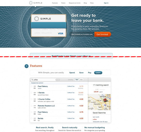
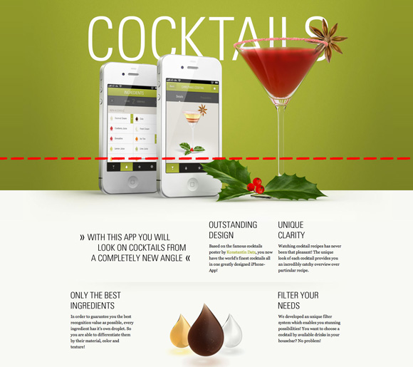
This concept of designing for a specific browser height became known as designing "above the fold", a term borrowed from newspapers. The objective for newspaper designers was (and still is) to engage the reader in the most important content above the literal fold of the paper, hopefully convincing said reader to buy entire paper. That was 1997.
Far Too Many Gizmos
The problem web designers were running into can still be seen on monitors larger than 800x600 (which accounts for 98.8% of the current market). All of the content on a page is scrunched up near the top in an effort to make everything available to the user without suggesting they scroll past 500-ish pixels.
Today, it simply doesn't make sense to design for a browser height.
First and foremost, if we are going to choose a height to design for, what do we choose? Unlike years past, the proliferation of screens from Cinema Displays to iPads to iPods means there's no common browser height. As of July 2016, W3Counter.com reported that 1366x768 was the most common screen resolution… at only 17.73%! 640x360 (15.15%) trails close, while bigger resolutions like 1024x768 (9.02%) and 1920x1080 (7.09%) aren't far behind either. Source
There's no common browser, either. Chrome, Firefox, Safari, Opera and Internet Explorer each have different toolbar heights and update their versions on a fairly frequent basis. While you could still get a decent guess from their averages, with the abundance of high resolution monitors, who knows if someone actually has their browser window open full screen? Do you?
Consequently, the common "fold" is as mythical a creature as the elusive unicorn. We can pretend it's there and be hopelessly disappointed when we realize it's not.
Let's get back to screen proliferation. Have you noticed how there isn't a standard for mobile device size? iPhones are different than Droids. iPads are different than Galaxy Tabs. User interface designers need to design for the ridiculously small and the ridiculously big, and everything in between. Content strategists and user experience designers need to consider these as well when determining what content is presented to a respective user, and how. Techniques like Responsive Web Design make the process manageable, yet some of the old philosophies of removing the scroll have still lingered amidst the progressive web.
Alternatively, let's approach technology from a hardware perspective. We have some sleek and stylish laptops, desktops and mobile devices available today, and one only has to visit their local Apple Store to be convinced of that. Product designers recognized the arduous task that scrolling once was. Remember? You'd have to drag your mouse over to the far right side to the scrollbar, press and hold it down and move with stunning accuracy as you read the page contents. Product designers responded by giving us scroll-wheels on our mice, and trackpads on our keyboards. Touchscreens provide arguably the most natural and uninhibited way to scroll a website's contents.
Trust Your Webbies, They Know What They're Doing
The job of a content strategist is an important one. They help to determine what truly is the most important and engaging message for a website. Giving the user a single action to take is a great way to present your message visually while not overwhelming them with choices. Too many choices leads to confusion, panic and ultimately disinterest. If you emphasize everything, you emphasize nothing.
The job of a user interface designer is equally important, since they need to take that message and frame it in an engaging manner that not only leads a user to the action, but also suggests there's much more to discover on the page (there usually is, right?). Whitespace, order and balance help define which elements are the most important and which ones fall as complementary in the hierarchy of the page. Remember, whitespace needn't be literally white or void of shape or texture.
The result of prioritizing your content and creating visual harmony through whitespace is a clear indication to the user of what you'd like them to discover. Invite the user to scroll by spacing out your content in an engaging way. You'll find that through embracing scrolling you'll enhance the likelihood of users discovering what options they have, gladly getting a feel for the entire page before they make a decision. Because they do. And yet, you still haven't neglected those who prefer not to scroll because your primary content is still at the top of the page.
We know users scroll, and they don't have nearly as hard of a time doing it as we once thought. The idea of having your most prized content in the front seat of your website still carries weight, but let's continue to guide users through meaningful stories and actions, set in breathable layouts that are easy to navigate and discover. Encourage scrolling and discovery.
Related Posts
How to Optimize Images for Better Website Performance
Learn to optimize your site with responsive images, modern formats, and lazy loading to improve performance and user experience.

User Onboarding Process: Guiding Visitors Through Your Website
We offer some tips on how to design a website in a way that helps users intuitively understand how to use it to accomplish their goals.
Results Matter.
We design creative digital solutions that grow your business, strengthen your brand and engage your audience. Our team blends creativity with insights, analytics and technology to deliver beauty, function, accessibility and most of all, ROI. Do you have a project you want to discuss?
Like what you read?
Subscribe to our blog "Diagram Views" for the latest trends in web design, inbound marketing and mobile strategy.


