Your vs. My: Creating a Conversational Interface
Dennis Kardys Head of Design & Development#Design, #Design Advice

When it comes to talking to users, many sites end up tongue-tied, having trouble keeping focus on who is talking to whom. Here are a few tips on how to refer to your users, and when to use "your" vs. "my" in your interface.
We all want to build friendly, approachable websites that connect with customers. But when it comes to talking to users, many sites end up tongue-tied, having trouble keeping focus on who is talking to whom. In this first post on creating a more conversational interface, let’s tackle a common issue: when to use “your” and when to use “my” when writing copy and crafting calls to action.
Hey! Your website is a person too.
Take some words and pictures, mix them together with a bit of code, and voila! ...a magical interface between your company and your customers is born. Unlike print and other types of media that can only broadcast in a single direction (a monologue), the interactive nature of a website allows it communicate bi-directionally (a dialogue). It’s not just a branded brochure—it’s an interactive service channel with personality! As a primary touchpoint, your website serves the same type of role as your customer support team might. An unpleasant online experience can be just as detrimental to your brand as a negative interpersonal experience. Regardless of who or what that point of contact is, people expect to treated with courtesy and manners.
The first step toward making a well-mannered website is to think of it as a person—after all, your users do.1 If your website was a person, what characteristics would it take on? The manifestation of these characteristics is referred to as a brand persona. We’ll talk more about brand personas in a future post, but for the sake of this discussion, the takeaway is that you want your website to seem as if it’s speaking to one person in one voice. Although this may seem obvious, it’s easy for that voice to become fragmented, adopting unique characteristics from whoever is authoring content. When you’re targeting a diverse website audience and have multiple content authors, things can get out of hand rather quickly. Identify the appropriate persona for your website and create some guidelines for copy and tone. It takes a bit of work, but it will pay off. Think about what you have to say, and how you would say it to a person standing in front of you. This is how you foster engagement.
If you’re more worried about the placement of social media icons than the words spoken on the screen, you’re doing it wrong
Establish who’s who.
With a single-voiced persona in mind, you'll more easily be able to write with a point of view—establish who is who. If your website represents an individual, don’t use language that makes it sound like you’re a big company. Posing comes off a bit, well…pretentious. Having a persona is only effective if it's believable, and you'll lose credibility if you appear to be inflating yourself needlessly. Get comfortable using the first person singular, and find the right balance between casual and formal tone.
Unless you're basing your site persona off a famous illeist like Elmo or The Rock, you may want to limit the frequency with which you refer to yourself or your organization in the third person.
In cases where your website represents an organization comprised of many different people, then using “we” and “our” (first person plural) is perfectly acceptable. When creating calls to action and messaging, speak directly to people, with a measured amount of personality. Here, the use of “you” and “your” is entirely appropriate.

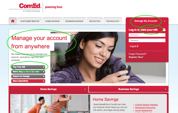
So far, everything’s pretty straight forward. But things can start to get complicated once any sort of personalization is attempted. Here’s an example of a confusing interface from Chicago’s friendly neighborhood power company, Com-Ed. Notice how they can't seem to figure out whether to go with “your” or “my” bill.

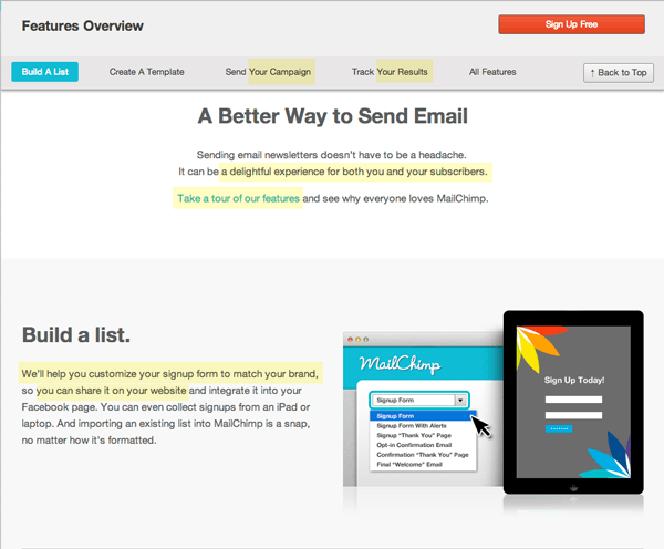
On the flip side, let’s take a look at how everyone’s favorite postal chimp, Freddie, handles their labels and messaging. On the Mailchimp site, the labels and copy clearly seem to understand that there's a person on the other side of a screen trying to interact with their service. The messaging specifically lets you-the-user know what you can do with their system. The interface speaks to the audience exactly how a real person would—with words directed toward them.

Exceptions
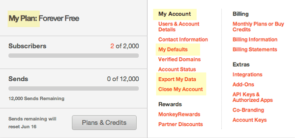
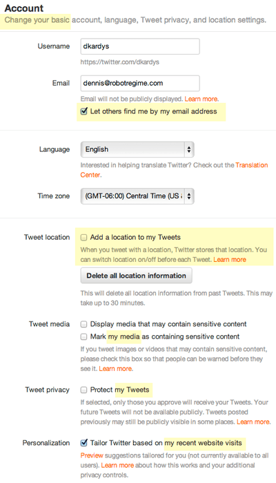
Using "you" and “your” to refer to the user makes sense in most instances, but not always. It can depend on who’s holding the reins to the screen. In a typical interaction, the system displays messages, reveals actions, and requests a response from the user. In other words, the website is guiding the interaction, and providing paths for the user. The system is in control. With this model, the website is acting like a kiosk or a concierge, catering content to the user. Other times, the roles are reversed, and control of the interface shifts over to the user. Examples of this include Facebook, Twitter, and most apps that provide a customizable dashboard. In these cases, the user is the one who curates the content. The user organizes information on the page, controls access to it, and can generate or delete components to suit their needs. When the user is in control, the use of “my” to indicate ownership and control is more common. This applies to configuration screens and account settings as well. Action items, individual settings, and buttons often use “my” to help the user identify what belongs to them.

When trying to decide if using “your” or “my” is appropriate, ask yourself these questions:
- Who is in charge of the curating the content on the screen—the site or the user?
- Who is in charge of how information is organized on the page?
- Who dictates control of how the information will be used?

Don’t overdo it.
If you're struggling with a specific screen, and you find yourself going back and forth about which point of view to use, ask yourself whether introducing pronouns even makes sense."You”, “your”, and "my” can make the interface more conversational, but don’t overdo it or it could come across sounding hokey, or worse, confused. Ask yourself whether the addition of pronouns truly serves to make the interface more straightforward. If they risk complicating the communication, there’s no reason you need to use them. Many sites and apps manage to capture a great sense of personality without them. This is quite common on mobile interfaces. Probably (at least in part) inspired by spatial limitations, a lot of mobile apps including Mint, Evernote, Instagram, and Dropbox use little to no pronouns in their interface. Instead, they rely on the use of clear, well considered trigger words and labels, displayed on unambiguously clickable/tappable buttons. When in doubt, err on the side of simplicity.
There are a lot of moving pieces to consider when planning and maintaining websites. With priority often placed on features, functionality, and layout, it’s easy to overlook the grace, or lack thereof, with which your website communicates with people. Switching between points of view can break the flow of conversation and leave site users feeling disoriented. On the other hand, by clearly establishing me vs. you, you’ll have an easier time creating the kind of direct and understandable copy that people can respond to.
References
- The Man Who Lied to His Laptop, Clifford Nass
Related Posts

User Onboarding Process: Guiding Visitors Through Your Website
We offer some tips on how to design a website in a way that helps users intuitively understand how to use it to accomplish their goals.
Agile Research: Enhancing Web Projects with Ongoing Feedback
Agile research ensures your web project evolves with real-time insights for greater ROI and user satisfaction.
Results Matter.
We design creative digital solutions that grow your business, strengthen your brand and engage your audience. Our team blends creativity with insights, analytics and technology to deliver beauty, function, accessibility and most of all, ROI. Do you have a project you want to discuss?
Like what you read?
Subscribe to our blog "Diagram Views" for the latest trends in web design, inbound marketing and mobile strategy.
