Common Misconceptions about Designing Websites
Dennis Kardys Head of Design & Development#Design, #Design Advice, #Discovery

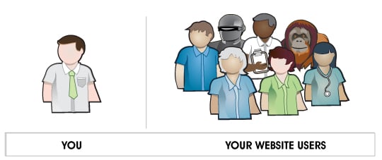
Realizing that you are not your website user seems like common sense. But being able to set aside your own preferences and think about things from your audience’s perspective is more challenging than it sounds.
There are a lot people ready to just dive in head first and begin building their website.
Unfortunately, it’s not quite that easy. You can’t simply begin by
building pieces of the site, then finessing them together. Think of a
website as an ecosystem, where in order for it to function healthily,
each piece must contribute seamlessly to the whole. Because of tight
timelines and budgets, many people choose the following process:
- Generate a list of desirable features
- Figure out what the site should look like
- Build it
- Revise and revise again until you reach total agony
This process is cumbersome, as the revisions quickly add up and end up
taking longer and costing more than all the initial development. All of
this happens as fundamental problems of the site remain unaddressed. So
why do so many organizations rush right in and think that this won’t
happen to them? I blame the following misconceptions about building a
website:
-
A Website is Just a Collection of Features
The more complex a feature is, the more resources you’ll need to
invest in the planning and development of it. Before you blow your
project budget on components that people may or may not even use, ask
yourself how it really helps your site visitors. Is the content honestly
useful for people? And does the complexity added actually enhance a
person’s ability to understand the information being presented?
Technological requirements need to support human goals, not vice versa.
Unless the answer is yes, it’s nothing more than an expensive novelty. -
Your Competitors are Doing It Right
I get a painful stomach ache every time I see a client point to some
functionality that they’ve found on another site and ask us to recreate
it on theirs. It’s not the fact that something has been done before that
bothers me. What actually bothers me is the blanket assumption that
other people are doing things right. Even if they are doing things
right, there’s no guarantee that things will translate well outside of
their original context. One justification I heard not too long ago was,
“Well this is how it works on other [similar] sites, so people will
expect it that way on ours too.” Are your site visitors really so
accustomed to your competitors’ sites that they will fail to see a
better, more usable option when it’s in front of them? Don’t take the
behavioral patterns of your users for granted. Perpetuating bad design
decisions benefits no one. Do your own research about what works. -
The User is Just Like You
Even armed with demographic information and first hand accounts from
your target audience, it is incredibly challenging not to mistakenly
think of yourself as the end user. Decisions are often made based on the
whims and taste of individuals within an organization, instead of
objectively with consideration for the primary users of the website.
Decisions about design should be justifiable, informed by research and
tailored to a specific segment of your target audience. Avoid making
assumptions about your users’ behavior. Conduct interviews and
observations with actual users, and resist the urge to impose your own
personal taste upon your audience.
There are likely many different types of people using your website, so
understanding their range of goals and motivations is crucial. Creating
fictitious users that represent segments of your audience (referred to
as personas) is a good method for capturing stories from and maintaining
focus on the different needs of your audience. -
Design is Arbitrary
Contrary to popular notion, design is not just making things look
nice. While tasteful aesthetics do play an important role in the final
outcome of the project, the aesthetics of the interface are just one
aspect of the whole design. Design is a holistic process. Think of an
experience where you’ve pushed a door that was meant to be pulled, or
when you’ve struggled to find the correct button on a remote to turn on
the TV on. Those are examples of poor design. Now think of a museum or
park that you’ve been able to explore without a map, or the casual ease
with which a 3 year old child can manipulate an iPhone. These are
examples of great design. These are interactions that are deliberate and
planned. Design involves deep insight, considerate decision-making,
plenty of testing and plenty of trial and error.Abandon the idea that design is something that exists solely in the
realm of the creative visionary. Real design is much more encompassing.
It’s the unification of each element within a system; it’s the plan as
whole. Design is a discipline shared with researchers, strategists,
writers, architects and engineers. That said, the role of the designer
is critical. It’s he or she that will work between all these different
groups and shape the outcome into a cohesive experience.
Budget Wisely
As you plan your website, I urge you to avoid rushing right into development. Take the time to conduct a discovery phase. Focus on establishing business goals and user needs first. Invest in good content and plan it strategically. Recognize the common pitfalls, and spend your budget wisely.
Related Posts
Agile Research: Enhancing Web Projects with Ongoing Feedback
Agile research ensures your web project evolves with real-time insights for greater ROI and user satisfaction.

User Onboarding Process: Guiding Visitors Through Your Website
We offer some tips on how to design a website in a way that helps users intuitively understand how to use it to accomplish their goals.
Results Matter.
We design creative digital solutions that grow your business, strengthen your brand and engage your audience. Our team blends creativity with insights, analytics and technology to deliver beauty, function, accessibility and most of all, ROI. Do you have a project you want to discuss?
Like what you read?
Subscribe to our blog "Diagram Views" for the latest trends in web design, inbound marketing and mobile strategy.
