Carousels and Sliders: What Are they Good for, Anyway?
Dan Rose#Design, #Design Advice

We previously discussed how best to use sliders and carousels, but are they something we should actually be using in the first place?
In the first part of this blog, we talked with Dan about the use of rotating banners (a.k.a. carousels or sliders), including what they are best used for, what type of material they should include, and how they should be formatted for mobile devices. But Dan had more to say about their use, so let's continue the conversation:
Dan, in the first part of this discussion, we covered the technical aspect of how sliders work, but let's take a step back and look at them from a more philosophical viewpoint. What do you think is their main purpose on a site? Many sites use them as the first thing you see on their homepage to display recent content or featured products, but do you think this makes sense as an introduction to what a site offers?
In general, I don’t think sliders/carousels are the most effective way to display content. The appeal for content creators is there: you can fit a ton of messages in a real estate-friendly zone, and the animation associated with sliders brings introduces a dynamic that’s often missing from the rest of the page. I’d argue that we need to suppress our desire to use sliders as an interface solution to what could be a bigger problem. You typically have four or five messages you feel are important to occupy something like a homepage banner. If you can’t commit to one message or piece of content, that might be an indication of weakness in your strategy. One message, displayed static and occupying 100% of someone’s attention, should fare better than five messages, rotating and occupying a fraction of someone’s attention.
That’s a pretty bold stance. Sliders are so prevalent, they’ve become an accepted, expected part of many websites, but it sounds like we need to start thinking about changing that practice. In fact, WSOL.com's redesign last year included some sliders, with a prominent rotating banner being the first thing you see on the home page. Do you feel that your design philosophy has changed since that design was completed, and has there been anything in particular that has impacted that change?
I think there’s a few things we’re doing on the WSOL homepage that don’t necessarily change my opinion of slider implementation, but do create a focused environment for our users. We accomplished this by doing two things: making the size of the slider fill the browser width and height, and using simple messages based on a single theme.
You’ll often see homepage sliders fill a fraction of the page, barely larger than the other elements. Where I think the WSOL.com slider is successful is in establishing visual hierarchy: when you arrive at the homepage, it’s hard to argue what we want you to engage with.
Additionally, many marketing sliders tend to be a mix of one message, then another, then a news story, then a photo gallery, then something different. In my opinion, sliders that stick to a single theme are easier to digest, and those with simple words and actions are even easier. That’s the premise by which the purely photographic ones that I previously mentioned do well, because they pare down the amount of items you’re requiring a user to consume to just one. Mixed messaging or loads of text on the WSOL.com slider would probably have weakened the impact.
I’m by no means attempting to rid the Internet of sliders with my opinion, nor am I saying that we found the exception to the rule. Rather, if you do choose to use them, I think their implementation needs careful consideration and then commitment to the chosen theme.
Can you think of any cases where a slider would still be a good fit for that “top of the fold” placement on a homepage? Maybe for an e-commerce site that wants to display featured products or sales?
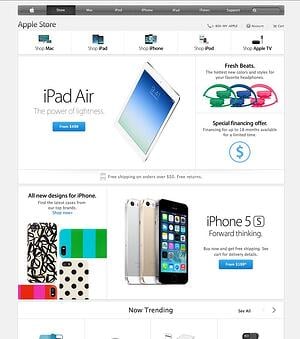
 Yeah, I think it’s tempting to go that route on an e-commerce site, absolutely. I still maintain that even though you seek to feature four or five products or sales, you can’t guarantee someone will stick around for #2-5. I like Apple’s approach. Hypothetically, if they employed a slider it could feature the iPhone, then the iPad, then the MacBook Pro, and so on. Instead, they incorporate their products across the entire page layout statically. It’s clear (at the time of this interview) they’re pushing their two newest products, the iPad Air and the iPhone 5s, but they do so through visual hierarchy: those product blocks are simply bigger than the others on the page.
You also bring up a good point about “top of the fold”. I have some thoughts about the fold and scrolling, but I also think using a rotator for your primary messaging on the homepage is often an effort to justify not wanting someone to scroll. Rotators can conveniently and neatly tuck multiple blocks of (important) content within a 300-400px tall space, if you don’t trust that your users will scroll any further. However, research says they do scroll. I’m in favor of letting all those important messages breathe openly on the page and emphasizing the one or two most important items through contrasting size, color, or typography.
If not front-and-center on a site’s homepage, where is the best place to use sliders and carousels? Are they better suited for internal pages or sidebars, as a supplement to other content? Do you think they could be used as online versions of slide show presentations that have been done elsewhere?
In spite of my reluctance to use them, an appropriate scenario would be to supplement other content. Sliders of photos pertaining to a specific event or product might be most helpful adjacent to an article about that event or product. For example, if an article is published on your blog about your company making a donation to charity, the format that might make sense is ‘Headline’, then ‘Rotator’, then ‘Article’.
I suppose sites like SlideShare and SpeakerDeck technically use rotators, although they’re manually advanced. For them, that’s a scenario where showing multiple slides at once or having to scroll through slides would not only be arduous, but also take away from the “art” of presenting. I suppose you could say PowerPoint and Keynote presentations are sliders in real life, but the context makes sense.
Well, you’ve given us a bunch to think about, and, as usual, you’ve got me reconsidering some of my assumptions about web design. Thanks for your time!
Do you have any questions or ideas about sliders and carousels? Please let us know in the comments below.
Related Posts

User Onboarding Process: Guiding Visitors Through Your Website
We offer some tips on how to design a website in a way that helps users intuitively understand how to use it to accomplish their goals.
How to Optimize Images for Better Website Performance
Learn to optimize your site with responsive images, modern formats, and lazy loading to improve performance and user experience.
Results Matter.
We design creative digital solutions that grow your business, strengthen your brand and engage your audience. Our team blends creativity with insights, analytics and technology to deliver beauty, function, accessibility and most of all, ROI. Do you have a project you want to discuss?
Like what you read?
Subscribe to our blog "Diagram Views" for the latest trends in web design, inbound marketing and mobile strategy.
