A More Flexible Workflow
Dennis Kardys Head of Design & Development#Mobile, #Design Advice

Learn how we adapted our design process workflow to include more prototyping, better design conversation, and new types of deliverables.
Over the course of the last two years, it's become clear that our long-used linear design process wasn't holding up so well. We had some lofty ideas for change, but weren't sure how to tactfully try and upend a process that had been in place since…well, always. We wanted more prototyping, more iteration, and more collaboration. What we learned was that we didn't need to go Agile to reach a more flexible, feasible workflow. Here's a glimpse inside our web development process and how it's been changing.
Our Old Way
Our agency had always been a waterfall shop. Our clients usually come to us with fixed budgets and timelines. It's a constraint we're comfortable working within, and personally, a challenge that I enjoy. Our process looked a bit like this:
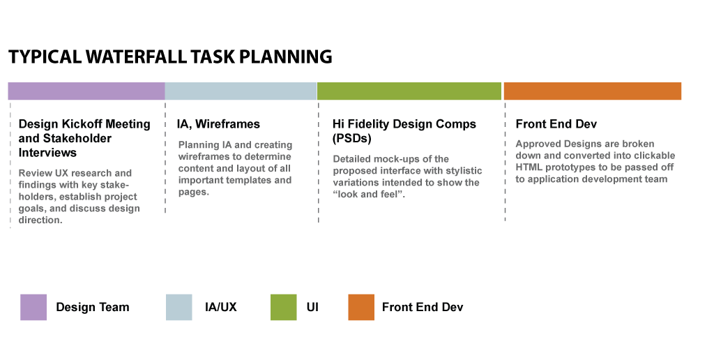
In theory, the design assembly line made us extremely efficient. Design documents were handed off like batons from one team member to the next as projects moved through stages. The reality, however, is that web design projects would often get held up as clients mulled over wireframes or fought for consensus within their organization. As we began pitching responsive design and taking on more mobile website projects, the pain points became even more noticeable. We were spending too much time in hypothetical discussions with our clients about how the design might translate to different types of screens and devices, or how intuitive an interface might be to users.
In a nutshell, there was too much talking and too little testing. Approval became an unspoken, but very real, design goal. Deliberating over website designs presented in a limited static context often led to stalemated debates. Instead of asking, "How do we come up with a better design solution?" we found ourselves asking, "How do we get this approved?" Reaching consensus would often require compromise. This type of compromise directly competed with our real goal: getting to the best design solution.
It turns out that responsive and mobile design caused us to recognize these process problems, but they were never the cause.
Accommodating responsive design didn't create new workflow problems, it just amplified ones that were already there.
The New Way
So, with process changes in mind, we put forth some new objectives and new attempts to address them:
Set better client expectations.
We wanted to present designs in a way which better communicated the variety of canvases, capabilities, and contexts through which people access the Web. We've addressed this by moving away from lengthy written specifications and cumbersome static design documents, and by placing more of an emphasis on hands-on workshops and interactive prototypes.
Lead more productive design conversations.
Often, discussions around deliverables led to conversations that were too broad to be actionable. In response to this, we've worked on narrowing the focus of our design deliverables. We're doing this by limiting the scope and purpose of each artifact, and by clearly identifying what each is and is not intended to specify, versus what each might simply suggest.
Increase collaboration.
We wanted to break away from the design assembly line and encourage more cross-disciplinary collaboration. We've started to select and shape design deliverables to be more conducive to staggering. This has provided more opportunity for designers and developers to work concurrently.
Test designs before committing to them.
We needed to be able to demo and test designs in a more real context and allow for changes further into the project. Diving into prototypes sooner, embracing iteration, and staggering tasks has helped with this.
Example Workflows
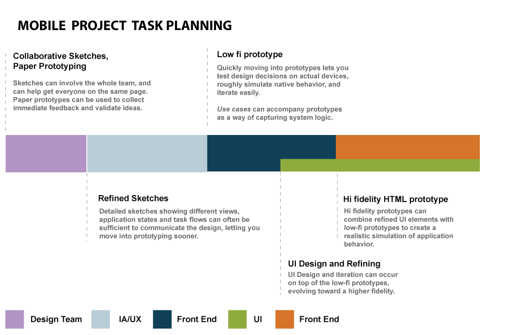
The following example shows how we might stagger tasks for a responsive design project, and another for how it can change when approaching a stand-alone mobile site. The exact activities will vary depending on the project, but it should give you an idea.
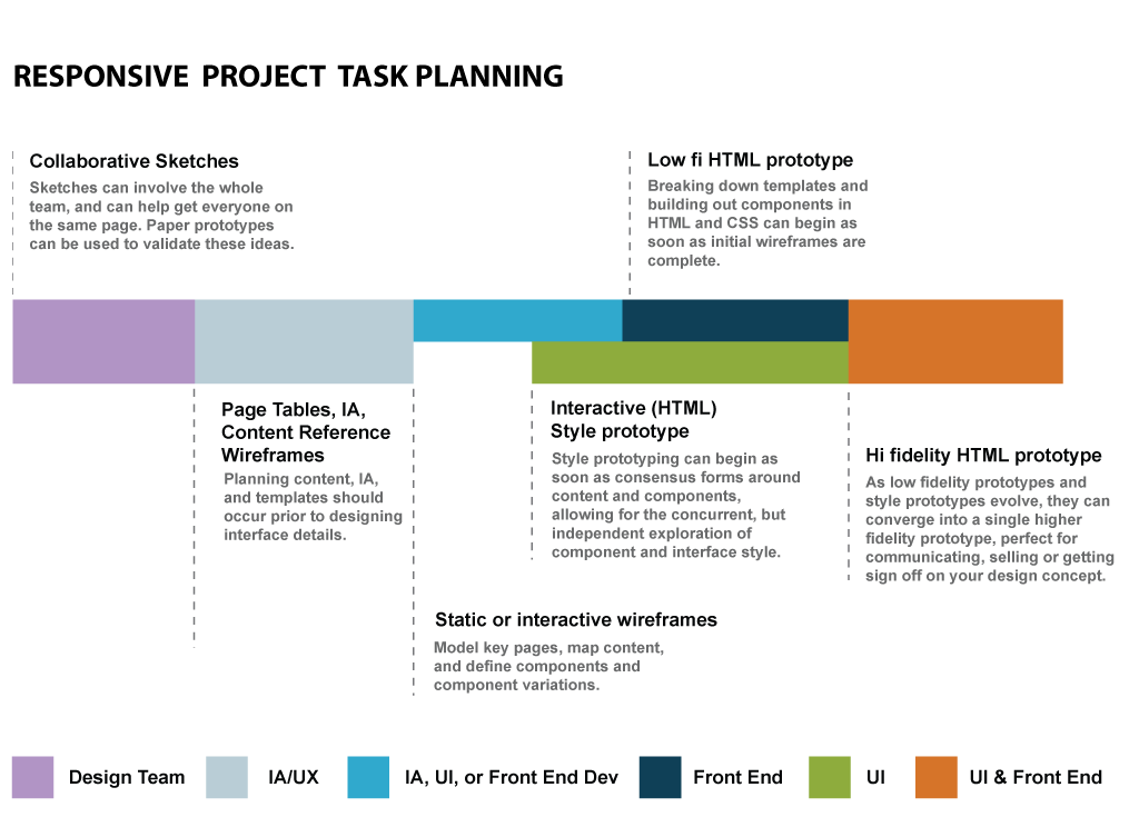
In a typical responsive design workflow, we'll begin with sketching workshops to explore ideas, and structured critique to narrow them. Paper prototyping is a tool we'll use to quickly validate some of our ideas with users. We'll then move on to information architecture (IA) work, prioritizing content and mapping that content to zones on different sized screens. Tools like page tables and content reference wireframes work great for this. Once we've gotten a good sense of the content and its priority, we can work more collaboratively.
Not every layout and interactive component needs to be set in stone to begin exploring style or how the client's brand might translate to the Web. Using Interactive Style Prototypes, we'll quickly iterate through multiple stylistic and typographic combinations, demoed in the browser. This helps to start building consensus around visual and thematic direction.
The goal here isn't to develop visual aesthetics ignorant of context, but rather independent of any single context.
By exploring design and layout concurrently, there is more opportunity for them to influence one another and evolve together, as opposed to the UI designer simply coloring in the wireframes. Once wireframes get to the point where they've described as much as they need to, and we can begin validating and revising things in a more realistic context: interactive wireframes/low-fidelity HTML prototypes. As both style and low-fi prototypes evolve, they can ultimately be woven together with confidence into a more holistic, higher fidelity prototype. Now, with all elements in full context, its a great time to refine, tweak and refine a little more. Ta-da...No sign-off on a static PSD required!
This process has worked well for us on some large enterprise projects, but what about for something smaller—for example, a standalone mobile site? In that case, a lot of what's described above might be overkill. It's unlikely that we'll need highly detailed wireframes. Instead we might dedicate more time to sketching out task flows or interface states. Then we can move directly into HTML prototypes. We might also skip the style prototypes in favor of doing all of the style exploration, iteration, and refining in context on the primary prototype.
None of this is set in stone. It's imperfect, and we're still figuring a lot of it out as we go. But what we've tried to establish through the process is the idea that design exploration doesn't have to be relegated to the earliest stages of a project, and that approvals don't (and shouldn't) have to preclude change later in the game. When both the client and dev team aren't hung up on getting the design locked down through an early sign-off, it gives the design a chance to evolve into something a bit more prepared to survive in the real world.
Pulling The Plan Together
In order to put any of these process changes into place, we had to respect the bottom line. Everyone is going to want to know what it will cost, how long it will take, and whether it will jive with their respective business model. In our case, we were tethered to a linear waterfall process. Client payments are usually tied to the delivery or approval of certain design documents, like wireframes or design comps. In fact, some clients have even been known to demand things like a certain number of design concepts and revisions! Aside: that topic warrants a post of it own!
The point is that whatever design process you want to propose, it needs to line up with business processes and expectations—both internal and for the client. So whose job is it to line those things up? Dear reader, congratulations: I bestow the honor upon you. If you do have someone who can help you with implementing process change, that's great! But if not, don't wait for somebody else to champion your ideas, or you may be disappointed. Take the initiative to think through how your design process and the business process are related, and then come up with a plan to pitch it!
Pitching New Processes Internally
Getting this green lighted internally, we had to clarify a couple things:
- We had to instill confidence that we wouldn't lose our hides implementing these new techniques. We did this by breaking the process down into tasks and estimating the time for each. We also described how working concurrently could reduce the awkward lags when a client gets held up on the approval of one particular deliverable, leaving certain team members left loitering in limbo.
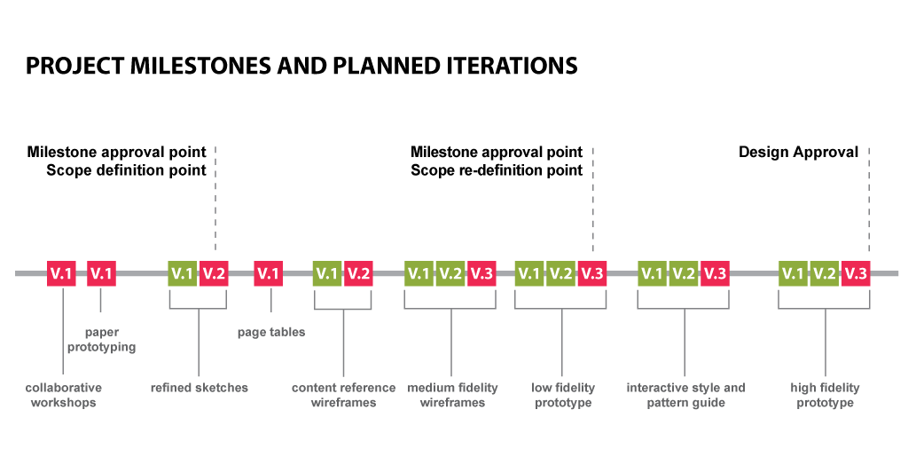
- We had to figure out how to prevent scope creep. We did this by allowing iteration, but also limiting it, and allocating a spot in the timeline for the client to add to or revise the scope (with a change order, of course).
- Lastly, we had to establish new milestones at regular intervals in the timeline. We mapped this out. Here's an example of what we created to communicate our plan internally:
Getting Client Buy-In
For client buy in, we explained some of the same things, though framed a little differently. We emphasized that the design and development process would be more efficient, because our team could work concurrently. We emphasized that with this new approach, the client team would be more involved in the design process. So, although they wouldn't have an early set of static designs to sign off on, ultimately they'd have more opportunities to provide feedback and contribute to the design, while seeing it in a much more realistic context.
The Bottom Line
So, its been almost a year since a lot of these changes have worked their way into our workflow, and we're starting to collect data on the results. Qualitatively, I feel like the challenges we've taken on and the changes we've adopted have led to better work. Our clients seem to be embracing it as well, with one reporting high-fives after a style prototype demo. It's encouraging to see people on the other end of the process getting excited about these types of things.
At the same time, things do seem to be a bit muddier, with lots of people knee deep in a project at the same time. But that's also a sign that more collaboration is happening, which is a positive outcome. The initial numbers coming in also look healthy, with projects staying within the target budget. I haven't noticed anything one way or the other in terms of overall project duration, though I'll be happy to share more information once we've analyzed more data.
Hopefully, sharing all this messy behind the scenes business will help you work out your own process in some way. I believe the key is to not accept your current workflow simply because you've inherited it. What we design and how we design is changing quickly; our processes must be as nimble as the adaptive sites we're designing. I would love to hear some of your stories. How have any new process that you've introduced succeeded or failed, and why? In the meantime, let's keep the Web evolving!
Related Posts
Accessibility Playbook Resources
Useful accessibility resources that are free for web designers, web developers, and content creators to help them build more inclusive websites.
Agile Research: Enhancing Web Projects with Ongoing Feedback
Agile research ensures your web project evolves with real-time insights for greater ROI and user satisfaction.
Results Matter.
We design creative digital solutions that grow your business, strengthen your brand and engage your audience. Our team blends creativity with insights, analytics and technology to deliver beauty, function, accessibility and most of all, ROI. Do you have a project you want to discuss?
Like what you read?
Subscribe to our blog "Diagram Views" for the latest trends in web design, inbound marketing and mobile strategy.
