5 Tips to Diagnose UX Issues on Your Website
User experience (UX) is a key component to a successful website. Follow these 5 tips to diagnose and fix simple UX issues on your website.
When you have a website, you want your website to represent your business well in the digital world and provide value to visitors. How do you know if your website is working as intended? What can you do when you spot issues with your website? This is where the user experience review comes into play. User experience (UX) review checks the health of your website and provides you with recommendations on how to improve content flow, navigation, and visual elements to help you optimize your web presence.
Dealing with UX issues may seem like a daunting task, but don’t be afraid. Here I will highlight five simple things that you can do to improve your website significantly.
1. How many different link and button styles are on your website?
Take some time to review your webpages and document how many different styles you notice. In general, we recommend a primary and secondary button style along with one to two link styles.
Links and buttons are one of the most basic web style elements that make up your website brand identity. It’s important to use the same button and link styles throughout the website to keep the brand image coherent. Buttons and links not only affect the visual design aspect of your website but impact user experience as well.
When users scan a page, they typically look for keywords, links, and buttons to figure out what they can do next. This all happens within a few seconds, and if users can’t easily figure out what’s actionable or not, they may miss out on important content that they need.
2. Do you use bold or italic text instead of headings?
I often see headings that use bold text instead of a proper heading style. Since headings are also a part of your website style elements, they need to be applied in a consistent manner throughout. It is important to consider that headings have bigger implications than simply making your website look put together.
Headings reveal a hierarchical structure of the page content.
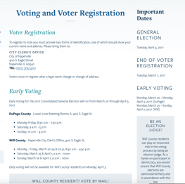
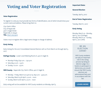
One important thing to remember if you are in charge of web content is that people typically scan a page before investing their time in perusing the content. This is where headings become useful. They help users quickly understand the content structure of a page while scanning. Look at the images below.


Both examples work if a user has time to read the whole page carefully. But if the user were to quickly scan the page, which example above provides different levels of content groupings that are easier to distinguish?
3. Icons? Images? Hold your horses.
Icons and images are great visual tools that catch people’s attention and can often convey an idea much more readily than using words alone. However, remember that that they are supplementary to the text or used for decorative purposes, unless icons or images are at the core of your message. When editors focus more on these decorative elements rather than the main content, they can do more harm than good.
Make sure that your text content is complete and clear BEFORE applying icons or images.
If you decide to use icons or decorative images on your page, you should first figure out what your main content is and layout the text and images accordingly. After you’re satisfied with your core content, then consider adding optional styling elements such as icons or decorative images. If you do things the other way around, you risk your content being unclear. Pretty websites don’t guarantee return visits; useful content does.
Stick with simple obvious icons.
Consider social media or contact icons, such as email or phone. These icons are so widely used that most people do not even need a text description to go along with the icons. But how do you use icons for other abstract topics, like course curriculum, leadership, environmental facts, or overview? You can hire a design professional and design custom icons that meet your brand image and your company's content needs. But if this is not in your budget or interest, it’s better to avoid using obscure icons that users may or may not understand. If icons make users wonder what they mean, they are merely distractors to users from reading the content.
4. Content. Content. Content.
I’ve talked about content so much in past posts. If you’re looking for specific tips on how to improve your content, please refer to previous blog posts.
The best advice I can share on how to improve your content is to have a friend or colleague read your webpage and take a moment to observe how that person reacts to the content. Watching where a reader struggles and becomes overwhelmed or confused can be an eye-opening experience for you and should help you consider your content from a new perspective.
5. “I don’t check mobile views when I work on my content”- Stop right there!
More people use their phone and tablet to access the internet now than ever before. When you’re done creating content for your page, review your work on a phone or tablet. Determine how much scrolling you have to do in order to read all your content. Are headings appropriately used? How are images loading up on your phone? Do they take too long? Do you offer a CTA (Call to Action) and related content links so users do not run into a dead end? Does the ordering of your content make sense?
There are small issues that you can DIY, but other things are better left to professionals. If you need help with navigation, content flow or new strategies for key pages, I would highly recommend reaching out to experts first to see what their recommendations are.

