4 Ways to Create Seamless Responsive Content With Episerver
Chris Osterhout SVP of Strategy#CMS, #Mobile, #Episerver, #Responsive Design

We look at the tools Episerver provides to help content editors ensure their site provides a good experience for users no matter what device they use.
As we’ve discussed time and again here on the Diagram blog, the future of the web is mobile, and it’s important for any company or organization to make sure their site meets the needs of its users, whether they are accessing it via desktop computers, smartphones, or tablets. One of the best ways that site owners can ensure they are meeting those needs is through implementing responsive web design (RWD).
For website owners who are considering a migration to the Episerver CMS platform, implementing responsive design as a part of this migration is a key concern. However, what they need to understand is that a site built on the Episerver platform is not “automatically responsive” if it isn't responsive already, so migrating their existing site to Episerver will not result in a responsive site unless the site’s front-end code is also updated.
The reality is that a site’s mobile experience is agnostic to the platform. A site’s front-end design is separate from the underlying technology on which it is built. However, while implementing responsive design will require additional design work, Episerver provides some incredibly helpful functionality for content authors.
We demonstrated some of these capabilities in our recent webinar, and we wanted to look at them more closely. Here are four ways Episerver’s suite of out of the box tools can make creating responsive content as seamless as possible:
1. Previewing Content At Different Screen Sizes
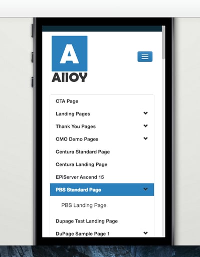
When content authors are creating a new content page, Episerver provides the capability to preview the what the final published page will look like in a variety of formats, including smartphones, tablets, and desktop monitors. This allows content editors to ensure that their content will display correctly no matter what device the site’s visitors are using.
2. Editing In The Mobile Context
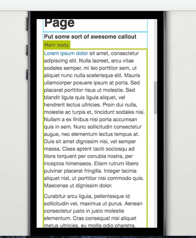
When editing a page in Episerver, content authors are not only able to preview their content at different screen sizes, they can also edit the content directly from these previews. Rather than making a change and then switching to “preview mode” to see how it looks on a mobile device, they can make these changes directly to the previewed content, making the content creation process faster and more streamlined. As far as I know, no other CMS provides this functionality.
3. Predefined Content Block Rendering
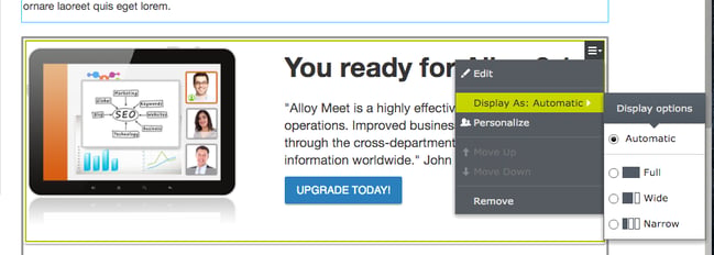
While Episerver provides a great deal of flexibility to its content authors, this can result in occasional issues with types of content being used incorrectly. Content authors aren’t experts in mobile design, so they may not realize that placing a content block or widget in a certain place on a page may cause issues when that page is viewed on a mobile device.
Episerver allows site owners to resolve this issue by allowing developers to set predefined renderings that specify where and how certain types of content blocks are allowed to be used. This will ensure that content blocks are used correctly and they can automatically resize these blocks to fit in smaller widths so that they display correctly and provide a good experience for all users, no matter what device, browser, or screen size they are using.
4. Previewing Content Blocks At Different Sizes
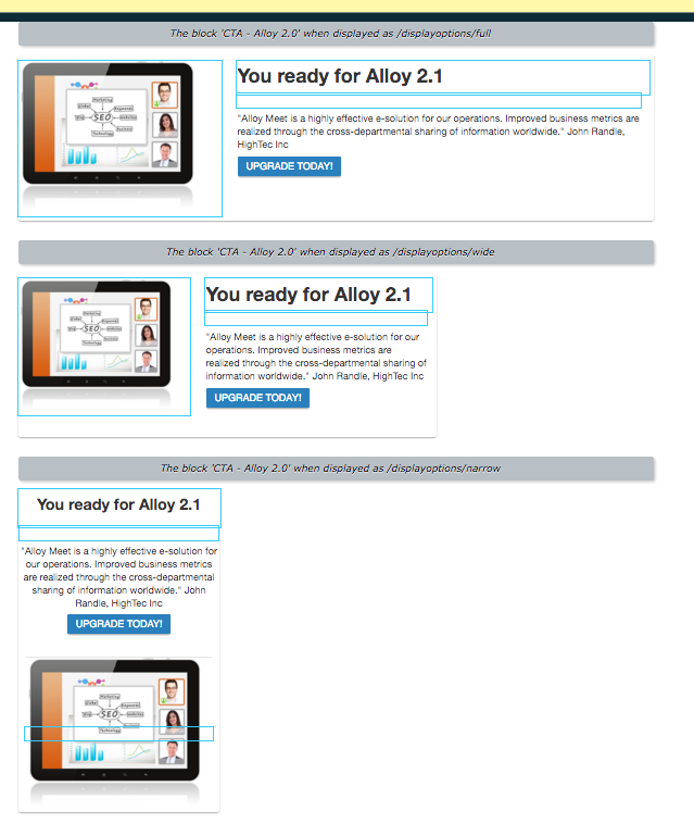
Episerver’s content blocks provide content authors with a great deal of power, allowing them to reuse pieces of content like author bios, calls-to-action, social media posts, or embedded videos across multiple pages. While these blocks are incredibly useful, they won’t always appear exactly the same on every page, depending on the size of the area provided or the width of the user’s screen.
In order to ensure that content authors understand how content blocks will appear on multiple pages, Episerver provides previews of these blocks at different widths, providing an idea of how the block will look when used in different places throughout the site. By being able to see these multiple previews, content authors will be able to understand how updates to a content block will affect how it is displayed on all pages, rather than on one single page. This will help make sure that changes made to a block on one page do not result in a less than optimal version of the block being displayed on other pages.
The capabilities that Episerver provides for creating, editing, previewing, and reusing content are incredibly robust, giving site owners the power to connect with their users, provide them with the information they are looking for, and demonstrate how they can meet their needs. If you want to know more about migrating to Episerver or implementing responsive design, please contact us. We look forward to helping you build a successful digital strategy!
Want to Read More About Responsive Design?
Read Responsive Design vs Mobile Websites: What's the Difference?
Related Posts

Why Choose a CMS?
We look at the advantages that a Content Management System (CMS) can bring to your digital and content marketing strategy.
4 Ways to Avoid Disaster When Migrating CMS Platforms
If you have ever migrated from one content management system (CMS) or eCommerce platform to another, you know how many unexpected issues can occur during the migration process.
Results Matter.
We design creative digital solutions that grow your business, strengthen your brand and engage your audience. Our team blends creativity with insights, analytics and technology to deliver beauty, function, accessibility and most of all, ROI. Do you have a project you want to discuss?
Like what you read?
Subscribe to our blog "Diagram Views" for the latest trends in web design, inbound marketing and mobile strategy.
