4 Umbraco CMS Features I Love That Content Editors Will Too
Renee Haas#Umbraco

Used in the right context these 4 features will make developers and content editors love using Umbraco CMS.
Umbraco is an open-source content management system (CMS) that is built to be as flexible as possible giving developers the freedom to customize the content editing experience. With that freedom comes responsibility to make smart choices that are going to make using Umbraco as intuitive and easy to use as possible. There are a handful of out-of-the-box features that Umbraco provides that I, an Umbraco Certified Master, have grown to love. When used in the right context, they can make content editing a breeze.
Document Type Icons
An absolute must for building out Umbraco is the use of icons for document types. With little effort icons provide context and help you find content faster and with more clarity. Icons can be assigned to different document types and are valuable in drawing the eye to specific content making it faster to find the content you wish to edit. In addition, there is the option to select various colors that can be useful in grouping similar content by type, sections of the site or purpose. What I love most about the use of icons is that they are not only useful, but they make the CMS experience friendly and fun too.
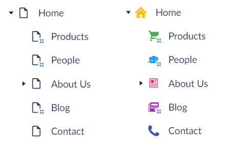
Before and after using document type icons.
Image Cropper
When tailoring the Umbraco experience for content editors, it’s important to remember that editors have varying experience with technology. For example, while some editors might have dabbled in Photoshop where cropping an image is second nature, other editors might feel completely at a loss for getting an image sized just right. That’s where Umbraco’s image cropper data type is a hero. Rather than relying on the media picker data type--which gives an editor no additional control--the image cropper allows them to pick pre-defined crops and select focal points. Simply configure the desired dimensions for common image placements like hero or thumbnail and the editor will have picture perfect image crops in no time.
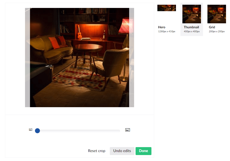
Image cropper with three crop options.
Grid Layout
An editor’s need for flexibility in content layouts can vary from site to site, or even from page type to page type. A blog post might simply need a rich text editor while a message board might need optional combinations of headlines, text, images and varying column widths. Programming that kind of flexibility can get cumbersome and even overwhelming for a content editor. In these scenarios I love using grid layouts and it’s a feature we brought to Diagram’s Accelerate for Umbraco. A grid layout allows you to easily define layout and content rules, such as what kind of content can be added and options for column width variations. Content editors will enjoy the flexibility to create a variety of content layouts and not be confined to narrowly defined options. The amazing part about all of this is that grid layout is built off Bootstrap, so most of the legwork to make these varying layouts responsive is done for you. What’s not to love about that?
Nested Content
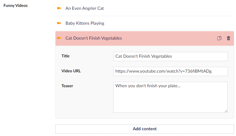
A content editor’s view of video nested content.
While grid layout provides flexibility in content layouts, sometimes we need structured repeatable information such as a video gallery with titles and descriptions or a directory of employees with an image, title and bio. My favorite way of organizing short groups of content that have a set of specific properties is by using nested content. Nested content allows developers to define a set of properties for a type of content, then repeat that content type as a group. Nested content makes programming simple as it clearly defines what information to expect and display while allowing content editors to work with a consistent, organized content editing experience.
Umbraco CMS developers have a responsibility to content editors to ensure that their experience is as user-friendly and intuitive as possible. With Umbraco’s flexibility to customize the editing experience for each site’s specific content needs, it’s important to utilize these Umbraco features in the right context given the content requirements. Use document type icons to provide context and optionally vary the icon colors if it can provide further clarity. The application of an image cropper is a great alternative to media pickers when defining crop options makes editing easier. Determine the ideal usage of grid layout or nested content with the content editors and the content structure in mind. I love working with these Umbraco features and the value that they provide, and when used correctly content editors will love them too.
Related Posts

What is Umbraco CMS?
Migrating your content management system? Why not consider Umbraco? Learn about this .NET CMS, pricing and why it's the right choice for your organization.

Why Choose a CMS?
We look at the advantages that a Content Management System (CMS) can bring to your digital and content marketing strategy.
Results Matter.
We design creative digital solutions that grow your business, strengthen your brand and engage your audience. Our team blends creativity with insights, analytics and technology to deliver beauty, function, accessibility and most of all, ROI. Do you have a project you want to discuss?
Like what you read?
Subscribe to our blog "Diagram Views" for the latest trends in web design, inbound marketing and mobile strategy.
